Lilla Rogers' Gorgeous Garden

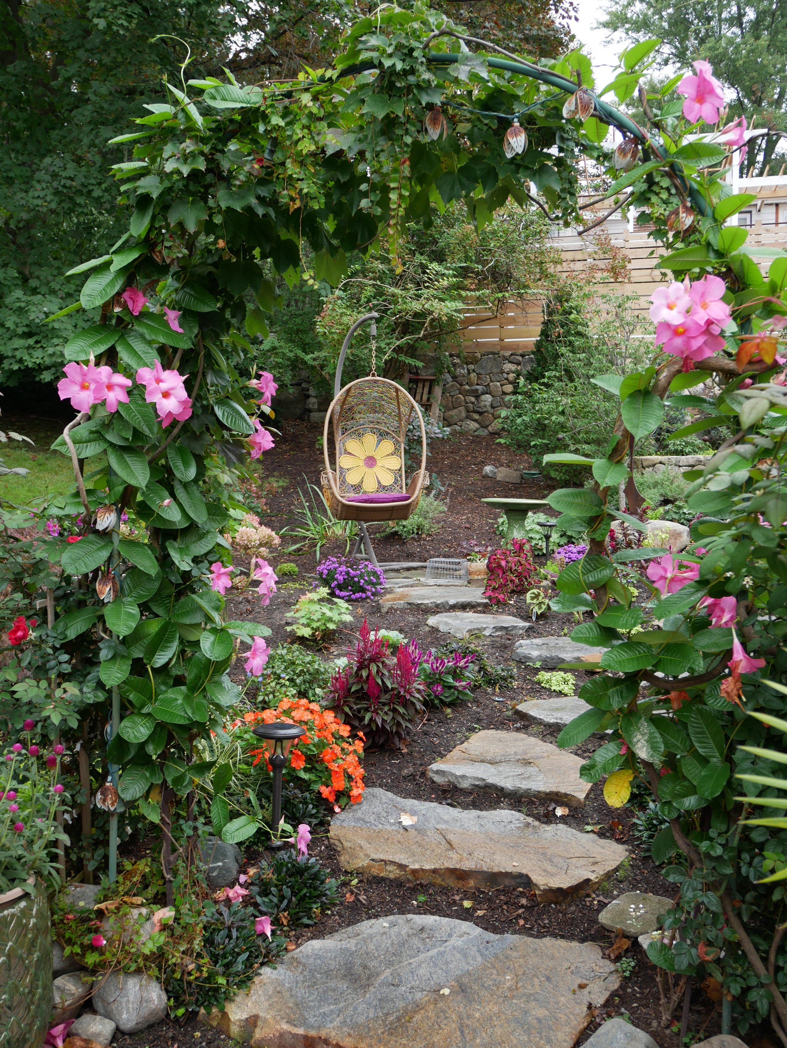
Illustration rep Lilla Rogers' home studio is inspiring (see this previous post) but her gorgeous yard is competing for attention. Full of pinks and lush greens, the yard has many places to sit, ponder and sketch, linked together with meandering paths and changes of elevation.

Lilla worked with Susan Redmond of Redmond Design Group on this backyard design project, that was completed earlier this year. "We had redone the front yard the previous year," says Lilla. She so enjoyed the process and collaboration with Susan, that this year they redid the back.

"We worked on the design together. It all started innocently enough," Lilla explains. "I simply wanted a fenced area to keep out the groundhogs, rabbits and chipmunks from my cutting beds and vegetables. Ha ha ha," she laughs. "Then project creep happened, happily." She added three garden arches "smothered in mandevilla and climbing red roses" along with lots of bird houses, a bird bath, many paths and an egg swing—"which is great for meditation."

Walking up the path leads to a very cute potting shed, that Lilla uses for writing—and perhaps as a retreat and studio for visiting guest artists someday.

A fenced area keeps critters out of her cutting garden; its symmetry offers a nice geometric contrast to the rest of the yard.

With decorations by both Lilla and her artists, the yard is punctuated by personality and colour.

Thank you, Lilla, for inviting me to your 2017 artists' retreat.

Surface Pattern Design Guide: Bessie Smith Moulton

There are 100 portfolios presented in the Surface Pattern Design Guide, 2nd edition (published in the current issue #32). They were selected from 744 submissions from readers worldwide who represent a variety of styles and levels of experience—from students to seasoned professionals. Though there are plenty of digitally-created patterns, there are also artists who use more hands-on methods like linocut, mono-printing or textile manipulations.

Bessie Smith Moulton of Babayaga Exquisites is a multimedia artist who has concentrated on the book arts for the past two decades, although her love of design extends to all materials. The last few years she has explored textiles and surface design. Her fabric designs are derived from naturally dyed plant material or various printing techniques, sometimes enhanced with embroidery or by collaging fabric patterns.

Bessie tells us more about her work and amazing studio on stilts:

I retired from my work as a graphic designer a decade ago and finally have been doing the artwork I have always wanted to do, making artist's books. Also, by combining my living situation with that of my longtime partner, I was able to build a studio of my dreams. Previously, I did my art and design work in nooks and crannies, on the dining room table, or in spare rooms. 

Click on the image to enlarge. Photo by Dana Hutchins.

Artists can work wherever they are, under any conditions. My studio is a bonus. It's large enough to hold workshops or studio visits. It is like a bird's nest built on stilts, over a pond, surrounded by trees and nature. There is a small Japanese garden below. I have named it Baba Yaga after the witch in the Russian fairytale who lives in a chicken coop, which moves around on chicken legs. 

Click on the image to enlarge. Photo by Dana Hutchins.

It is a place where I can go to be contemplative, study, or find inspiration. It is a comfortable place with all the materials at hand to do textile work, monoprinting, collage or multimedia that go into making artist’s books. 

Bessie in her basement studio.

I have an area in the basement of the house where I do printmaking, make paper, prepare cyanotypes and other crafts such as pottery, metal and glass work. 

Joseph Campbell said it best, ”To have a sacred place is an absolute necessity…a place where you can simply experience and bring forth what you are and what you might be… a place of creative incubation.” 

For 99 other profiles of Surface Pattern Designers, pick up the current issue of UPPERCASE magazine.

Karin and Camilla

Karin Eriksson and Camilla Engman have a new collaboration:

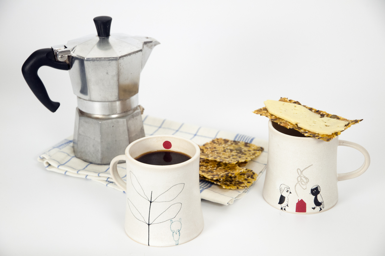
"To mark our ten year anniversary as friends, we – illustrator Camilla Engman and ceramicist Karin Eriksson have created a set of cups in Karin's design with Camilla's illustrations on them. The cups come in a beautiful handcrafted paper box. We haven’t made a limited edition this time, but if you want the cups to arrive in time for Christmas you shouldn’t wait too long."

It's time for some fika!

Above is a spread from the book that I published all about Camilla Engman. It's from 2009 but still oh so inspiring. The Suitcase Series: Camilla Engman is available in the UPPERCASE shop — just 144 copies left of this gorgeous book. Here's the video I made from my wonderful trip to Scandinavia to visit Camilla:

Frankie's Spaces

It looks like a trip to Australia will be in my diary early next year! I look forward to sharing those details when I can (I'll be speaking at a conference). I won't have time to visit or explore much—and I certainly wouldn't have been able to snoop inside the homes and studios that are featured in Frankie magazine' Spaces book. I blogged about the book when it was first released, and now it is back on its second printing.

Spaces is a collection of homes and homes-away-from-home around Australia: from the east coast capitals to the Adelaide Hills, the wilds of Tasmania and the southernmost tip of Western Australia. The designers, photographers, foodies, musicians and artists you’ll meet inside might have cleaned up a bit for their photos, but their homes aren’t fancy. These are the kind of places that take time and energy to put together, with some of the most precious things in them passed down through families, collected on travels or picked up from the side of the road. With a focus on resourcefulness and individual style, Spaces celebrates the importance of home to a creative bunch of Australians. 

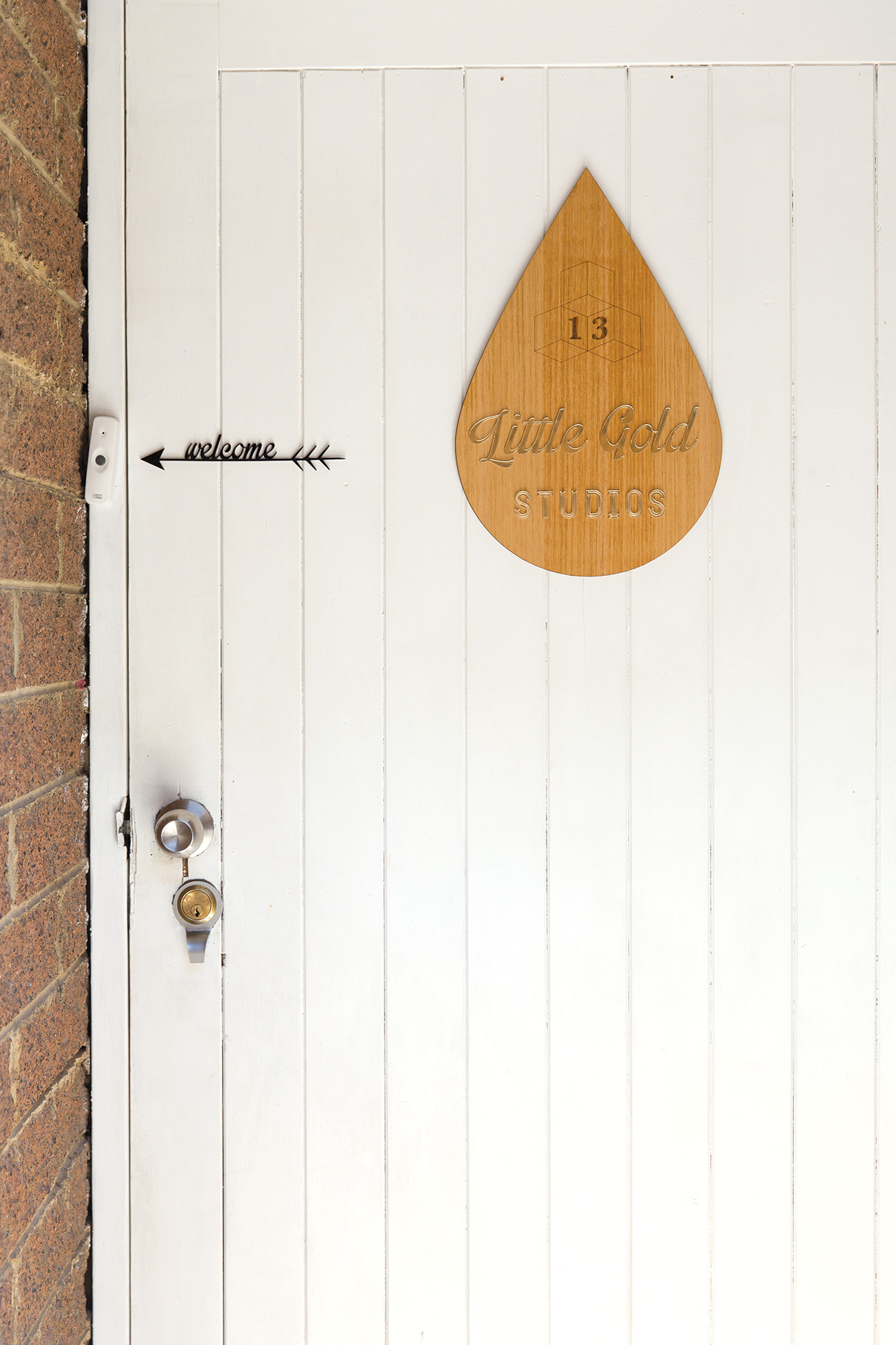
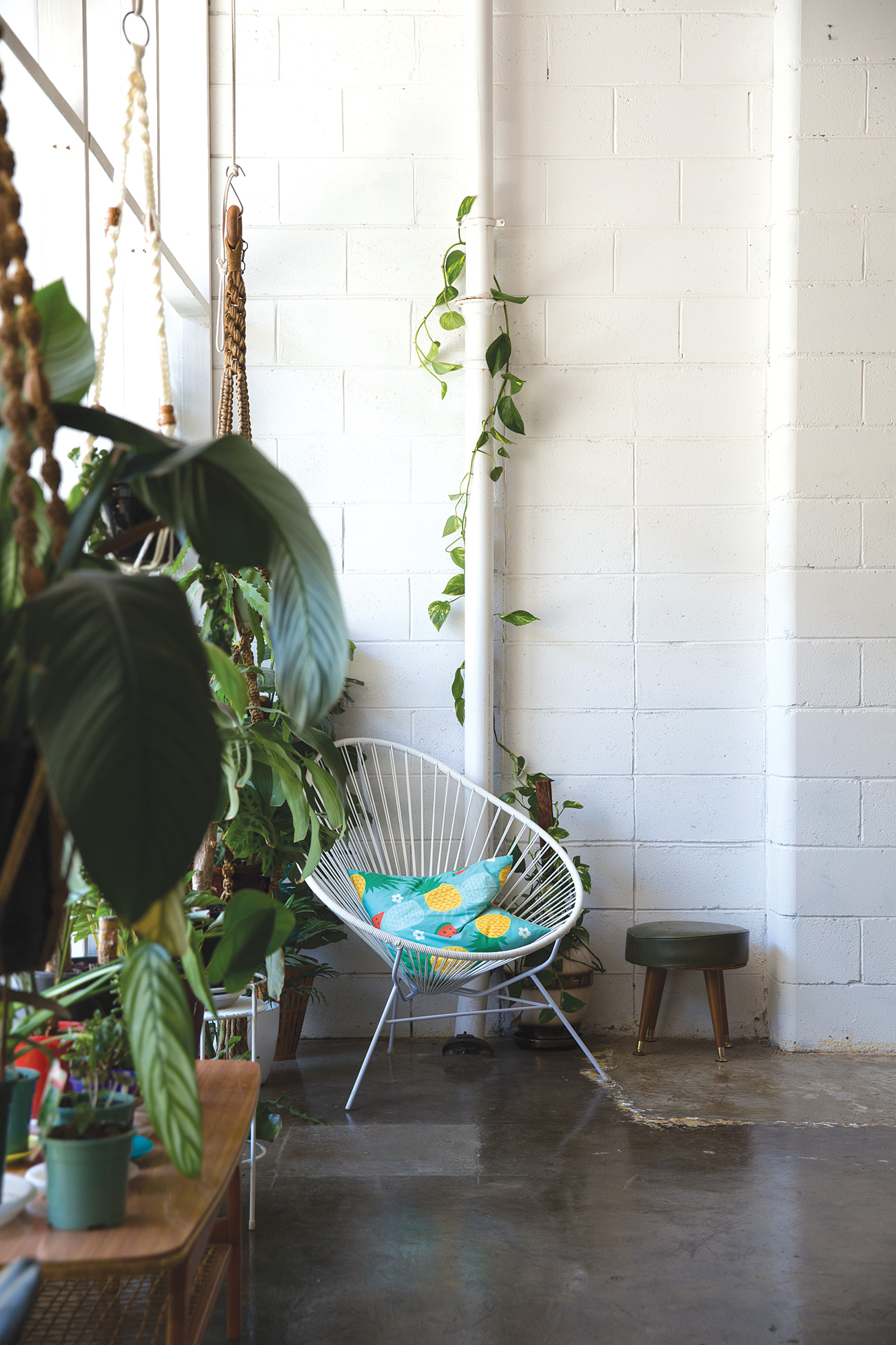
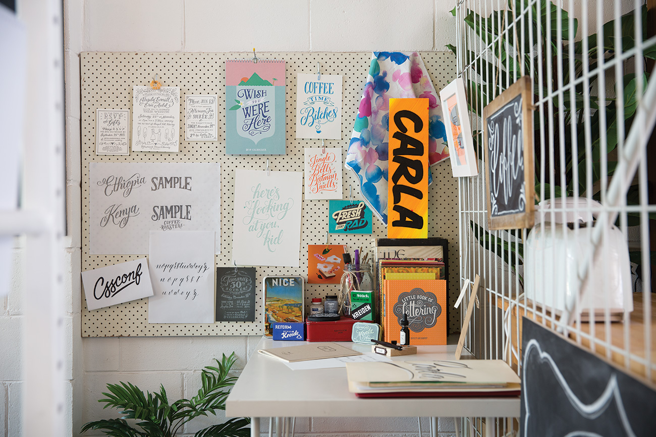
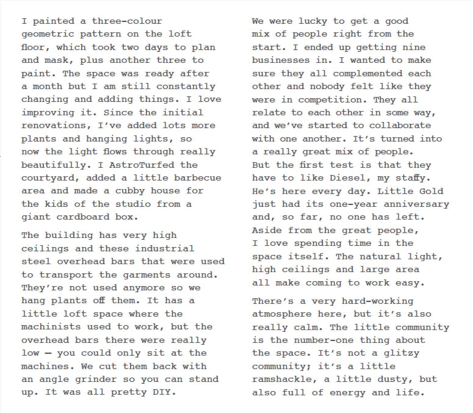
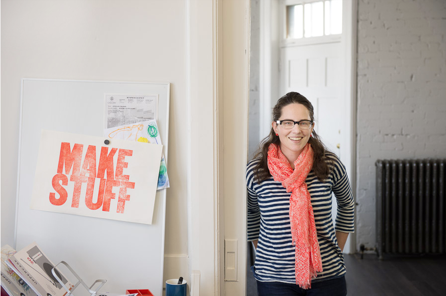
Below is an extract from Spaces volume two featuring the co-work studio Little Gold. Sass Cocker is interviewed by Chris Harrigan with photos by Hilary Walker.

Sass Cocker from Little Gold Studio

Little Gold Studio is a shared creative studio in Brunswick, Australia. Founded by Sass Cocker of the stationery company Ask Alice, Sass and her creative coworking studio are featured in Frankie magazine's forthcoming Spaces book.

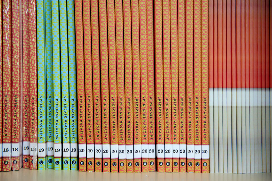
Ask Alice's work and that of forty-nine other talented designers are profiled in issue #17's Stationery Guide. Purchase a back issue of #17 while its still in stock (and take a whiff of our special scratch and sniff cover!) or you can read the Stationery Guide excerpt, below.

Mundania Horvath documents the dwellings of Pittsburgh

GUEST POST BY LISA TOBOZ

Lisa Toboz is a Pittsburgh writer, photographer, and curator of the Studio 5013 window installation series. Follow her adventures in art and travel at The Long Way Home Diaries.

Artist Mundania Horvath didn’t call herself an illustrator until a few years ago: “I considered myself a designer who was good with computers and print design.” But as former office manager of Moss Architects, she’d watch coworkers doing draft sketches, wondering how she could incorporate traditional illustration into her graphic works.

Wanting a yearly project, Mundania created PGH/Digs (PGH is Pittsburgh’s affectionate acronym), an illustration series combining art and design with her admiration for Pittsburgh dwellings. 

Pittsburgh’s various neighbourhoods are clustered with old, at-times unusual, solid brick homes that have survived decades of industrial history, and Mundania—who moved from Uniontown, Pennsylvania to Pittsburgh to attend the Art Institute—drives around the city’s one-way streets, taking photos of houses that she can draw, then fine-tine later in Illustrator and Photoshop.

The simple, clean lines of ’60s ranch-style, “311 S Dallas Ave, Point Breeze” (first in the series, above) appealed to her love of geometry and retro design. She pays attention to house details others may not notice: a slanted roof, or asymmetrical windows.

While the house structures are characteristic of Pittsburgh, Mundania makes them universal through bold colour. Inspired by artist Lisa Congdon’s bright and playful colour schemes, Mundania experiments with changing the original house colours in her pieces to ones you may be reluctant to try in real life. “If you could paint your house any colour,” she says, “it might look like this.” 

PGH/Digs has evolved into commissions—some clients want their houses replicated, while others give Mundania free reign with shape and colour. This year, she’s taking the project beyond city limits, illustrating well-known houses designed by famous architects, in addition to the Pittsburgh houses that continue to inspire. “This project has opened a lot of doors for me, connecting me to people throughout the city. It’s completely changed how I view myself as an artist.” 

3 Fish Studios

Located just steps from the beach, 3 Fish Studios is a welcoming storefront and working printmaking and painting studio.

Annie Galvin chats with a guest.

That's Annie's show-stopping large-scale print of a California bear hug. (Prints available in their online shop.)

Robotic inspiration for Eric Rewitzer's linocuts.

Eric Rewitzer

Annie's painting area, nestled on the second floor overlooking the shop.

3 Fish Studios was the perfect venue for the UPPERCASE Show and Tell. Annie and Eric were generous hosts and their studio was amazing. Formerly a neighbourhood grocery store, and then a dance studio, now the main open area is their gallery and printing area. In the back is a small kitchen that leads out into a covetable garden space. Although it was too chilly to hang out in the backyard, with a large state of California-shaped table, it would be great for a gathering. Upstairs, Annie has a painting studio along with a computer office area and a table for preparing prints. There was a small window peering over the shop area which would have made for a great photo of the Show and Tell proceedings, but I was a little too busy with that to steal away for a picture. I took photos and notes of all our presenters and I'll share them on the blog throughout the week. Lots of great creativity to share!

A Gathering of Stitches

A Gathering of Stitches is a communal making space for textile and fibre artists located in Portland, Maine. Members can rent equipment and studio space and benefit from a community of fellow makers. You can even rent a "Fairy Godmother", most likely to be proprietor Samantha Hoyt Lindgren, to consult on your project and help you learn new equipment.

Their doors open mid August this past summer, so they're still new and growing. But with a great roster of classes and equipment, it looks like A Gathering of Stitches is stitching up a firm foundation in this creative community.

UPPERCASE would like to thank A Gathering of Stitches for their ongoing support of UPPERCASE. As we transition away from ads in our print magazine, we are very pleased to have A Gathering of Stitches' ad on our blog sidebar. If you are a creative business owner and would like to advertise with us, we would be happy to hear from you.

the truck art of India

I received a wealth of submissions for the recent Open Pitch. Not all of them can be included in print, so I will share some here on the blog.

The following submission is from Shantanu Suman, a graphic designer from India who currently lives in Asheville, North Carolina:

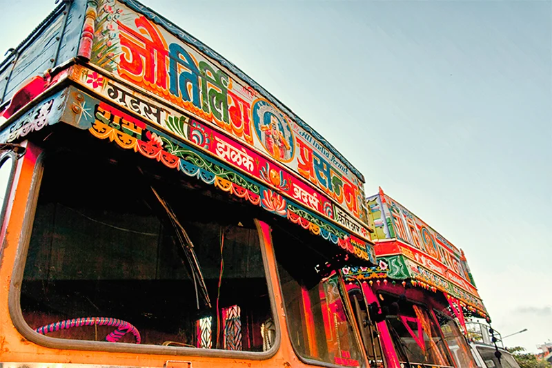
After working as an art director for over six years in India, I left my job in 2010 to get my Masters in Graphic Design at the University of Florida. During this unanticipated adventure I found myself exploring a long buried love for the truck art of India. During the summer of 2012, I traveled to India for 45 days, carried out extensive research and collaborated with friends to make Horn Please—a documentary film that narrates the story of the Indian truck art. I was accountable for developing the concept and doing the research of the project. I also acted as the joint director, director of photography, and art director to work with a team of individuals who played their own role during the making of the film." 

The trucking industry of India has played an instrumental role in shaping Indian trade and commerce for decades. It’s a common belief among the truck owners of India that a beautiful truck is good for business and therefore the owners decorate their trucks with ornamented designs and vivid colors. My initial research during 2011, demonstrated that little has been done to document this vernacular art form of India. It was this lack that inspired me to do further research. During the summer of 2012, I traveled in six cities of India and collected information about the Indian truck art and people related to this art form. The information collected during this trip has acted as a catalyst to develop some design projects, an exhibition and finally a documentary film — Horn Please

The designs painted on the trucks do not merely represent an aesthetic purpose, but also attempt to depict religious, sentimental, and emotional viewpoints of the people related to the truck industry. My research focused on the ways in which this vernacular art form influences not just the world of art but also the lives of its artists and the truckers who interact with it on a daily basis. Largely, it investigates whether this traditional art, as a unique form of expression, will survive the modern day demands of the industry. 

Project Horn Please is aimed at raising social awareness and engaging people through voices and aesthetics of the Indian trucking Industry. It marks the starting of a campaign in which design would serve as research rather than another visually pleasing piece of work. Although I have spent the last couple of years researching on the truck art of India, I believe that there is more that needs to be accomplished. During my research trip in India, I stumbled upon something really beautiful. What I found in these places of decline was a sense of pride among the people working there. There was an excitement to share their stories—about their families, about the journeys, about the beautiful symbols and motifs and of the age old tradition of decorating their trucks, of which still not many are familiar with. They are the torchbearers of a beautiful custom of adding a personal touch and creating an identity with their vehicles. 

For a photo gallery of Indian truck art, click here. For forthcoming screenings of this documentary, go here.

#mycreativeplace

The theme of issue #20 is loosely inspired by "broadcasting". In our interpretation, we define it as the ability to get ideas to the masses through means of communication such as radio, television, social media, posters and craftivism.

I thought it would be fun to use the technology that is literally at our fingertips to invite our readers to broadcast a bit about yourselves. Using Instagram video, share a little tour of your creative place and post it to @uppercasemag #mycreativeplace. Is your creative place a sunlit studio (I'm so lucky!) or is it a comfy corner of the couch? Is it a nice collection of curios and art supplies that defines your creative place or are you most creative when outside for a walk? Whatever or wherever it is, share #mycreativeplace with us!

Show and Tell event in San Francisco!

Mark your calendars for this UPPERCASE Show and Tell at 3Fish Studios...

Janine Vangool, publisher, editor and designer of UPPERCASE magazine and Annie Galvin and Eric Rewitzer of 3Fish Studios will be hosting a Show and Tell on Thursday, January 30. 

Are you an illustrator, craftsperson, designer or a generally creative soul? Do you have an idea to pitch? Have you dreamed of being published in UPPERCASE? Bring one example of your work, prepare a 2-minute spiel and share it with us! (Or, just come and say hi. We're really friendly and would love to meet you.) It will be a fun and informal evening. 

Refreshments will be served and copies of UPPERCASE will be on hand. We look forward to seeing you soon!

Thursday, January 30
7:30pm-10:00pm

4541 Irving Street
San Francisco, CA 94122
415-242-3474
directions 

Please RSVP and let Janine know if you'll be "showing and telling" or just "watching and listening".

Want to know about Annie and Eric? Pick up issue #11 and watch this video:

featured stockist: Kinokinuya NYC

A thrilling moment, to see UPPERCASE so prominently featured in Kinokinuya's New York store.

 Kinokinuya. For those of you who have been to one of their US locations, the name is enough to conjure visions of book heaven and washi-tape wishes. I go to their San Francisco store anytime I'm in that city and I've been to the Seattle location, too... but NYC is now top on my list... why? Because I got to see UPPERCASE magazine amongst all the amazing books that I admire and covet. A dream come true.

And here is The Suitcase Series: Camilla Engman translated into Japanese and published by Graphic-sha! It was nestled with all my favourite Japanese lifestyle books and looked right at home. The Suitcase Series was inspired by these sorts of Japanese books (that I can't read, mind you!) and so it has come full circle to see this book and Dottie Angel translated for a Japanese audience.

help Makeshift in Brooklyn!

UPPERCASE's regular creative business columnist Rena Tom's Makeshift > Brooklyn Kickstarter is just a week from finishing and they have $10,000 to go. They'll only get funded if they reach this goal, so if you're in the Brooklyn area and want to support your community, please pledge. If you support the coworking concept but live elsewhere, they also have a selection of rewards for international or out-of-town pledges, some of which are pretty unique:

Julia Rothman. Julia will draw your portrait in her distinctive style; it will become part of a wallpaper pattern that we'll use in our conference room. You'll get a digital file of your portrait plus the postcard and digital download."

Pick up a copy of our current issue to read more about coworking and Rena's experience with Makeshift San Francisco.

Makeshift Brooklyn

UPPERCASE is very fortunate to have Rena Tom as our regular business columnist. Rena's words of wisdom assist and encourage creatives whether they're just starting out or have been entrepreneurs for a while. I certainly learn a lot from reading Rena's columns (she posts past columns on her site) and from following her blog

Rena and partners are venturing from San Francisco to Brooklyn to launch a second location for the Makeshift Society. It is an ambitious space and they're aiming to kickstart a portion of the funds to support this coworking endeavour.

Rena's forthcoming business column goes into greater detail about the trend in coworking, based on her experience on the San Francisco Makeshift location that just celebrated its year anniversary.  Read more in issue #19, out very soon.

p.s. I just read on their blog that Makeshift is hosting Work/Life 3 illustrator Cleo Papanikolas tonight for a workshop. Contact Makeshift for details

WL3: James Gulliver Hancock

As the printer puts the finishing touches on our forthcoming book, Work/Life 3, I am pleased to share some recent work by James Gulliver Hancock.  James is an Australian illustrator based in New York. Frost*, a creative agency based in Sydney, commissioned James to create illustrations for a bank's call centre. On initial reading, that may have sounded like a boring assignment, but just look at the results! The following text is from the Frost* press release:

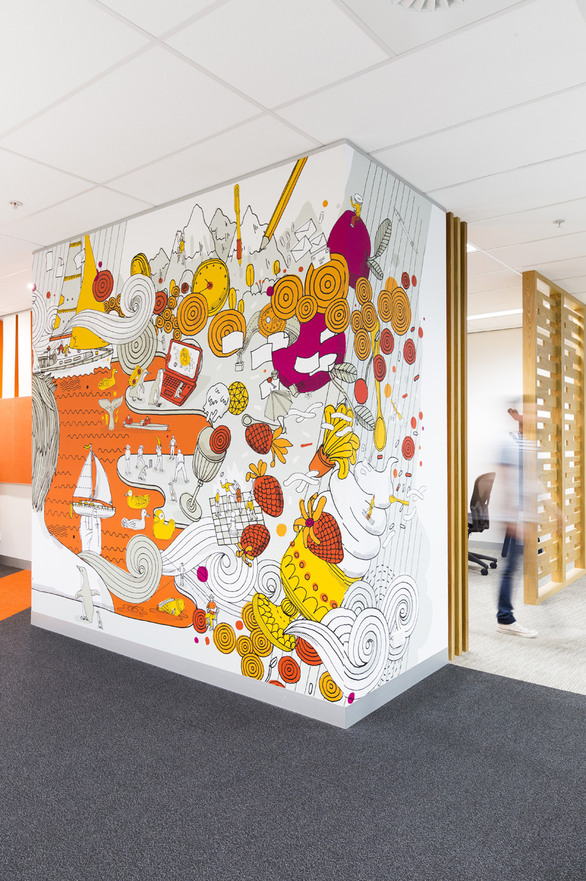
The Frost* Environments team recently completed an exciting new project for employees at Commonwealth Bank’s Melbourne (Australia) call centre. Working in collaboration with Interior Designers Davenport Campbell, the agency was commissioned to animate the newly refurbished activity-based workplace, whilst inspiring and engaging staff who are often working on intense, monotonous tasks.

The scope of work included signage and way-finding for the seven level development, alongside super-sized environmental graphic backdrops that added a distinctly Melbourne identity to the inner-city office.

The concept involved visually breaking up the building's floor plate by referencing urban-laneway culture in work zones and parklands and nature in the break-out spaces.

Working closely with New York based illustrator James Gulliver Hancock, they established sub-themes of work, rest and play to tell the everyday stories of the city's inhabitants, with a fantastical twist. Hidden pockets of quirky detail were incorporated at a micro-scale, as a cheeky nod to the city’s laneways where there is always something new to discover. A graphic language formed from iconic Melbourne architecture also helped embed the signage firmly into its location.

unique space

I had the pleasure of interviewing Sonja Rasula, founder and creative director of UNIQUE USA for issue #17. Together with her team, she's come up with another amazing way to support the modern maker movement. THE UNIQUE SPACE will be a co-working, office and event space housed in a 100-year-old building in LA. To fund a portion of the renovation costs, they've created kickstarter campaign with benefits that include a two-day guest pass to co-work in the space. 

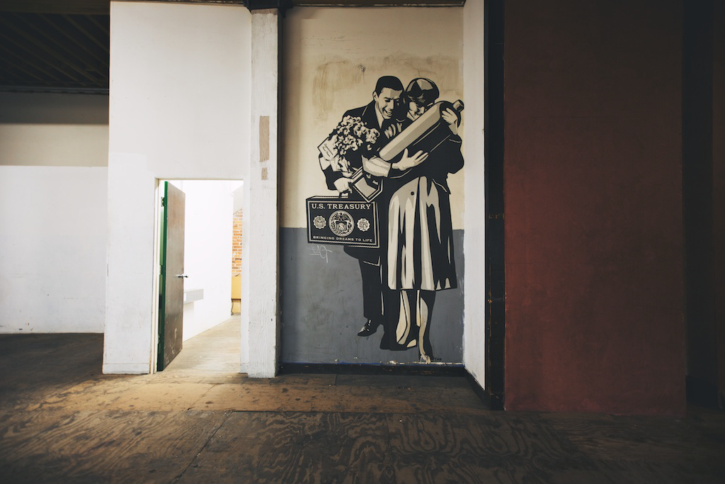
This wheat paste street art is a Shepard Fairey piece left over from when he had his studio there years ago.