Calling Card: A Gathering of Stitches

A Gathering of Stitches is offering some amazing retreats next year! Participants will have the opportunity to work intimately with some really talented and generous teachers in 2015. 

Sherri Lynn Wood of Daintytime will be spending two intensive days teaching a small group to quilt with curves, April 30 and May 1, using the extensive facilities of AGOS. Wood’s first book, The Improv Handbook for Modern Quilters will be published by STC Craft in March of 2015.

In July, Amy Butler and Heather Jones will lead a small group through their colour stories, and how to translate them into quilts. This exclusive retreat will take place at the luxurious Point Lookout resort in Northport, Maine.

The dynamic trio of Carolyn Friedlander, Chawne Kimber and Rebecca Ringquist take up residence at the Medomak Retreat centre in Washington, ME, in August, for a long Slow Stitching weekend. Slow down and connect to needle and thread or floss in a summer camp setting with a small community of stitchers.

For the garment sewists, Lauren Taylor of LLADYBIRD will spend four days exploring the joys of making clothing at AGOS. Start the Fall with new skills for creating your very own handmade wardrobe at this September workshop.

Thank you to Samantha Lindgren for her support of UPPERCASE magazine through the purchase of this Calling Card ad.

Make Something Monday

Feedsack quilt block by reader Lisa Courtnage

Happy Monday and Happy December 1st! There's no denying that the end-of-the-year rush is on. Today, let's just catch our breath and get back to doing what we love... making things! 

Today's the day to create a good old-fashioned made-by-hand gift. It doesn't have to be something complicated, just something simple showing your recipient that you took some time. Time is precious; showing someone that you took time out of the busy season to make something heartfelt is powerful and will be appreciated.

Create something that comes from YOU. It could be a handwritten card, a little embroidery on a hankie, some cookies made from scratch, a simply sewn pin cushion, an ornament made from found objects, a collage of pretty pictures, a finger-painting made with your child, a handmade notebook of blank pages with a found-paper cover... just take a look at an issue of UPPERCASE and I'm sure an idea will come to mind.

Stay away from DIY posts and Pinterest! These days, it is too easy to get bogged down into the perceived perfection of Pinterest and the tyranny of step-by-step craft instructions. Today's the day to unplug from these distractions. Comparing yourself to others and following directions can be so detrimental to genuine creativity. Use your own ideas, your own resources, your own ingenuity... you will make something that is from you and your heart.

Make something out of nothing. Be experimental. Be silly. Creativity comes from letting yourself go a little bit. If you worry about stitching a straight line, today's the day to zigzag. Just gather up all your creative supplies onto the table and see what emerges.

Enjoy the process. Making things is a lot of fun! Share what you're up to on Twitter and Instagram #makesomethingmonday #uppercasereader. 

A huge thank you to UPPERCASE reader Lisa Courtnage for the beautiful quilt block made of vintage feedsacks. She writes, "I saw your request for feedack fabric on your blog. I found a vendor while at the International Quilt Festival in Houston who was selling charm squares of feedsack fabric (5 inch squares) so I snagged a few packs. I have enclosed 419 one-and-a-half-inch squares. Also made a mini-quilt block with the leftover scraps... that is how quilts were made back in the day!" Once again, I'm amazed and inspired by the generosity and talent of UPPERCASE readers. Thank you, Lisa.

My son was with me at the office when I received Lisa's package of feedsacks. He was instantly enamoured with the quilt block and wanted it for his teddy bear. I have other plans for the block, so I suggested that we make teddy his own special blanket. All my sewing supplies are here in the office so Finley selected a favourite feedsack square from Lisa's packet and we went to work. My mother-in-law had recently downsized her fabric collection and I acquired some of it, so the blue and white fabric was at-the-ready. The train fabric was purchased from a thrift store on a car trip home to Saskatchewan some summers ago. Finley helped by sitting under the table and pushing on the sewing machine pedal or by taking out the pins as needed. Within an hour, we had a cute but wonky tiny blanket and a happy mother and son. We'll both cherish the blanket for the stories of how the fabrics were chosen and the fun we had putting it together. I think teddy liked it, too.

Speaking of quilts, I'm excited to tell you that I'll be one of three judges for next year's QuiltCon! I look forward to spending three days surrounded by beautiful quilt designs.

Have a lovely day making something!

Inspired by Little Golden Books

UPPERCASE magazines on display at this past weekend's New Craft Coalition.

Did you know that UPPERCASE's spines were originally inspired by Little Golden Books? I've always loved their eye-catching golden spines and wanted my magazine to have a similar recognizable shelf presence, even when displayed spine out. Using a silver foil for issue 23's spine brings that idea full circle. It's nice when childhood inspirations still apply to your adult life!

ReWorks Monthly Recycling Challenge

I’m pleased to introduce a new face and new monthly feature to the UPPERCASE blog. Solita Work is the proprietor of ReWorks Upcycle Shop in Calgary’s Inglewood neighbourhood. Solita uses the skills she honed during years in graphic and exhibit design to curate and style the spacious and eclectic shop. Everything in the shop is made with some form of recycled, upcycled, repurposed or reclaimed material. You’ll find coat racks made from old rails spikes, purses from vintage license plates or a cast iron tub transformed into a cozy sofa. The business reduces waste, but also inspires people to redefine their understanding of waste. 

"It is so exciting to see how far artists, designers and crafts people have come in finding ways to reuse materials originally destined for our landfills,” says Solita. "Not only does the shop bring in talent from around North America but also gives me the opportunity to continue to be creative through in-house product development, graphic design, retail displays and community connections.”

In its third year, Solita has big plans for her shop, hoping to rearrange the configuration to make way for a "making area” which will allow her to do sewing and make objects for the store. The new studio area will also be available for makers-in-residence to create their own work or be inspired by the treasure trove of interesting objects and textiles that she as amassed in her back-room storage. Word has gotten out that Solita likes to find uses for discarded things, so she has often been the recipient of good quality items that need some TLC before they become new products. Last week when I visited the shop, Solita showed me some opaque glass bottles that were previously emblazoned with branding. She’s experimenting with sandblasting new designs and illustrations to upcycle them into new products that will be available for sale in the shop. Solita thrives on the challenge.

This brings us to the ReWorks Monthly Recycling Challenge. Every month, Solita will post an old item to be recreated into something new. She will pick her favourite entries and share them here along with the following month’s challenge. If she likes the idea enough, she may even offer to help you develop it into a viable, new product for sale in Reworks Upcycle Shop. 

ReWorks Monthly Recycling Challenge: Blue Jeans

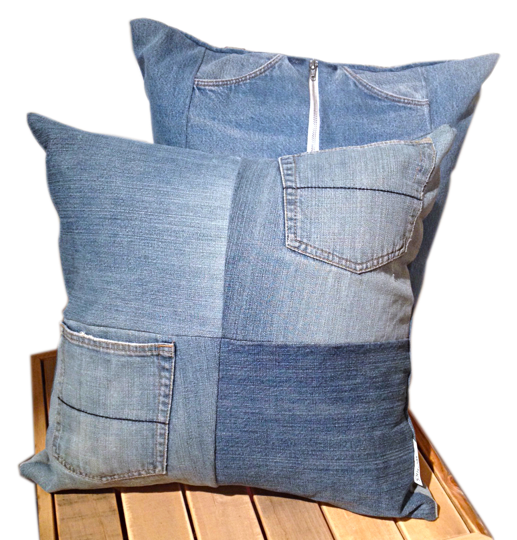
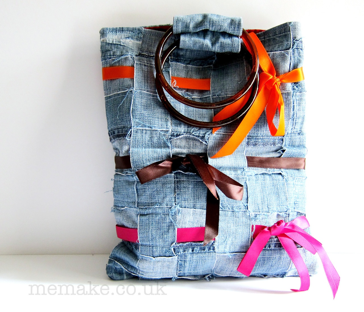
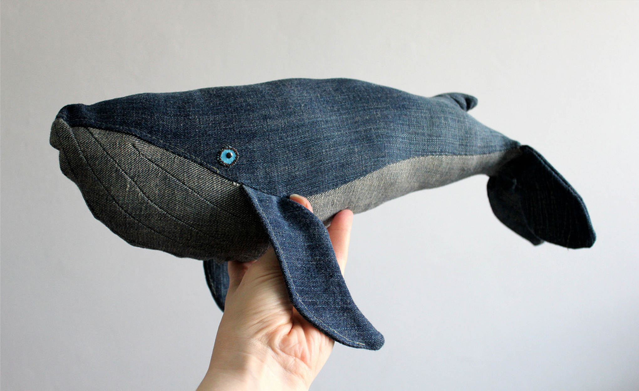
This month’s challenge is to create something wonderful from an old pairs of blue jeans. Blue jeans are a durable staple item in just about everyone's closet. Inevitably, blue jeans will rip or tear at the knee or a pocket but that doesn't mean that there isn't still lots of good fabric left over for repurposing. Show us what you can do with that leftover fabric!

I have included a few examples to help get your inspiration flowing. Blue jeans have already been made into comfy pillows, a wildly creative bear rug and a colourful hand bag. I look forward to seeing what you make.

To enter the challenge, please email good quality digital photographs of your creation (800 pixels wide at 72 dpi) to info@shopreworks.ca. Entries must be submitted on or before the last day of the month to qualify for the challenge. Entries must also include your name, contact information and a brief description of your creation. If you have any questions about this challenge, please direct them to Solita at the email listed above. UPPERCASE is not involved in the administration or adjudication of this challenge.

Denim bag made by UPPERCASE reader Jane Bernstein. 

Denim whale by Mevrouw Walvis

Hervé Tullet's new book, Mix it Up

If you haven't experienced a book by Hervé Tullet, seek one out. His books offer fun experiences that use the format of the book to play with creative concepts. His latest book, Mix it Up! demonstrates how colours combine to form new colours and tints. It's a great book about mixing paint... and you won't get your fingers dirty!

Hervé is in Toronto next week, leading a hands-on art event for children on Wednesday, October 8. On October 9 at 2 pm he will be drop by Type (883 Queen St W, an UPPERCASE stockist) to sign copies of his new book.

Lisa Congdon's Art Inc.

Lisa Congdon's new book Art Inc. photographed with an original painting that Lisa gave to me.

I'm pleased to be part of the blog tour for Lisa Congdon's just-released book, Art Inc: The Essential Guide for Building your Career as an Artist. I've witnessed Lisa's growth as an artist and I am happy that we have collaborated quite frequently over the years.

In the early days of UPPERCASE, before it was a magazine, I ran a small gallery and bookstore. The exhibitions included artists from around the world, and Lisa was a frequent participant. (During this trip down memory lane, I'l be linking to old posts and articles on an antique version of the UPPERCASE website.) I exhibited Lisa's work as early as 2006, for the Big Little Show.

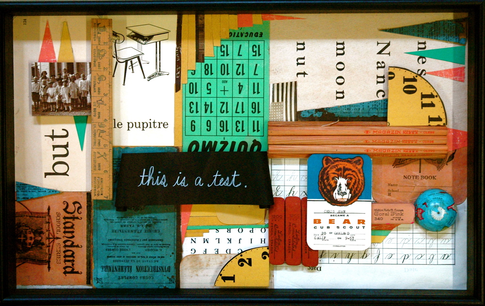
Her work at the time was mostly collage-based, with touches of painting and geometric decoration. In 2008's Old School exhibition and book, I sent artists packs of school-related ephemera for inspiration and inclusion in artworks. Lisa's submission in a shadow box was one of my favourites. (Old School is out of print, but you can see more here.)

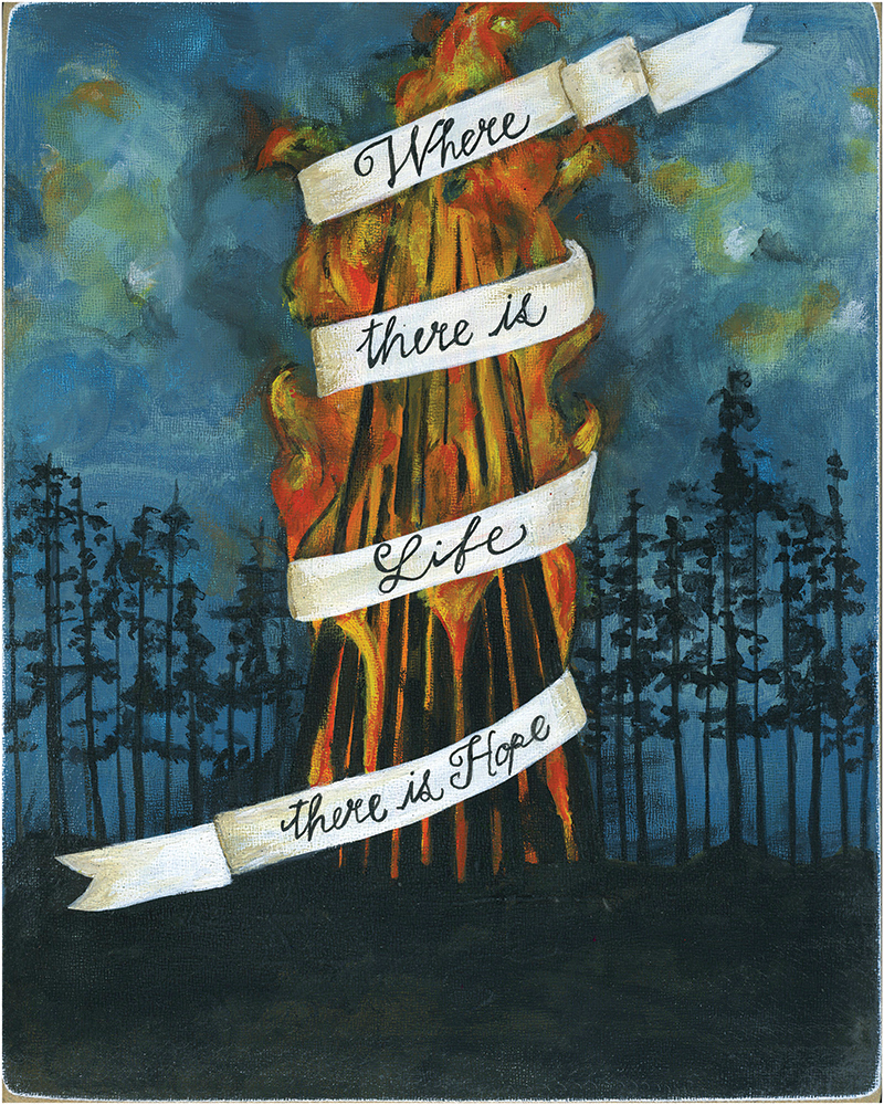
In 2009, a theme of Bonfires was presented both as a gallery show and an article in an early issue of UPPERCASE. (Issue 3, out of print.) By this time, Lisa was doing much more painting and incorporating handlettering in her work.

The vintage ephemera of her early collages would later play an integral role in our biggest collaboration, the publication of the book A Collection a Day. In 2010, Lisa embarked on a year-long project to document her collection daily online through photos and the occasional drawing of arrangements from her curious collections. I began following her daily blog post right from the beginning and for months I thought to myself, "This would be an amazing book." I was expecting a baby that March and put the idea aside thinking that some big publisher would swoop in! But even late nights with a new baby couldn't dampen my interest and to my great pleasure, Lisa agreed to publish the book with me!

At 448 pages, this thick tome of a book is packaged in a collector's tin where you can keep your own little collections. Full of vintage ephemera, inspiring typography and curious oddities, A Collection a Day is a highlight of the UPPERCASE library.

Baby Finley in one of his first gigs as hand model.

Finley opens the tin to reveal the book inside.

Here's Lisa at the opening and book launch for A Collection a Day at The Curiosity Shoppe in San Francisco.

So that brings us to 2011 and the release of Collection a Day. Meanwhile, Lisa's illustration career was on at full speed. Lisa was also a profiled artist in 2011's Work/Life 2: the UPPERCASE directory of illustration.

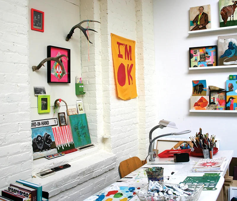
Lisa's studio in 2011.

Fast forward to fall of 2013, Issue 19, and UPPERCASE magazine featured Lisa's travel sketchbook from a trip to Iceland. She also wrote and photographed an article about Alvar Aalto for that issue.

Over these years, Lisa has learned a lot. She is someone who pushes herself to learn, to improve, to explore uncharted territory. She has shared the stories of her high and lows, the ups and downs, on her blog in her forthright and personal style. With the release of Art Inc., she has created a precise and inspiring guide on how to make a career as an artist. Published by Chronicle Books (and illustrated by Work/Life 3 artist Karolin Schnoor), Art Inc. is the go-to companion for advice on how to start your journey as a professional artist... and how to stay motivated and to grow your artistic practice as you mature in your art.

Many congratulations to Lisa on adding 'published book author' to her long list of creative accomplishments. I'm honoured to have worked with you so many times along the way.


Art Inc. is available to purchase directly from Chronicle Books or wherever books are sold. The other books mentioned are by UPPERCASE and available in my shop (if they're still in print). Lisa has signed copies of A Collection a Day in her Etsy shop as well.

"It is almost impossible for me to create without colour."

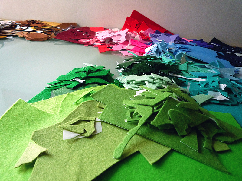
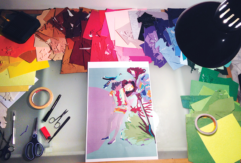
Columbian artist Ximena Escobar has taken the concept of paint by numbers into a completely different medium. By cutting up coloured felt, she assembles portraits of beautiful women with florals. "This medium is very special to me because the colours also have texture and that makes my work richer and more interesting," she explains. "It is a medium where I can't mix the colours, every one of them is a solid block, so I need to use them in a way I can blend the colours without mixing them. That challenges my work and takes me to some interesting and exciting results."

"Colour is a very important element in my work. It defines the mood of what I am creating, it is also the way I communicate my aesthetic no matter which medium I'm using. Colour inspires and challenges me all the time."

"Colour is part of what I am as an artist. I was born in Colombia which is a very tropical and colourful country. It is almost impossible for me to create something without colour, it is how I communicate what I want to say."

Ripe bananas and other outtakes from issue 22

Cover artist Shelley Davies was wonderful to work with. And she is always so generous with her creativity! Above's an "outtake" called Ripe Banana.

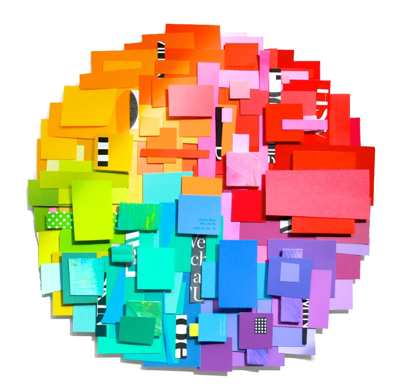
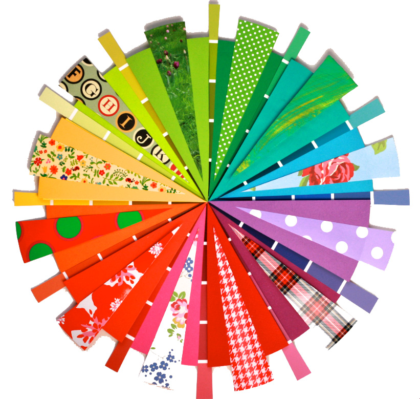
I asked Shelley to make the collage for the cover because of her affinity for working with paint swatches, her love of incorporating type into her work and her overall exuberance for bright colour. Here are some more colourful compositions from Shelley. 

Here are some roughs that Shelley made when working on the cover. We decided that the radiating colour wheel was more dynamic, but these studies are nice on their own!

Jason Taylor's Everyday Objects

Jason Taylor was featured in Issue #21, and has an exhibition this week at The Harley Gallery from June 11 to August 10, 2014. 

Here is an excerpt from Fun with Function written by Vinciane de Pape

Jason Taylor is an established, UK-based artist and industrial designer whose innovative work plays with the form and function of readymade objects. His line of lighting and furniture designs has been sold internationally and exhibited in museums and art galleries around the world. Jason brings an artistic sensibility to his design process and enjoys the restrictions and challenges of creating unconventional products inspired by mundane objects.

Finding early on that he enjoyed manipulating and inventing simple designs from objects like tin cans, Jason pursued an education in design to follow his passion for experimentation and to further develop his skill set.

“I chose to do a 3D design course because of the techniques I could learn in different materials, but the focus was mainly on functional objects,” he explains. “An object would become my starting point and I developed different paths I could go down, such as developing a different function for it or remaking it in a different material.”

Somewhat frustrated with the compromises required by the commercial side of product design, Jason decided to go back to what he does best—experimenting with objects. This is when his Everyday Objects project came to life.

“I learned with a previous project that I could be more productive than I thought, and I also enjoyed the sculptural side,” Jason describes. “But what would be the reason and how could I make myself do it? I had seen other people do everyday photography projects and then thought of the double meaning of ‘everyday objects’ and I had to go for it.”

To read the full article about Jason Taylor in Issue #21, click here.

Saskia Wassing's bright and colourful textile work

Saskia Wassing is a textile artist who lives and works in Toronto, Canada. She attended the Embroidered & Woven Textiles program at the Glasgow School of Art in Scotland. Saskia submitted to our recent open call for submissions “What Does Colour Mean to You?” and we’re pleased to share more of her beautiful work with you today.

Saskia’s unique fabric pieces reflect the work of an extensive traveller. Influences from Britain, Polynesia, New Zealand, Australia, India, and Canada are visible in her colourful creations. 

"Colour means everything to me. It is the most important element in my creative life. I realize that sounds extreme but I love colour. I live and breathe colour and as an artist and designer, colour is the driving force behind all of the work that I produce,” says Saskia. 

"If I had to live and work with only two mediums it would be my fabrics and my threads. Cutting, piecing and embroidering with these wonderful, tactile materials allows me to translate my sketchbook diaries into my personal colourful language so that other people can see and feel colour the way I do. Turquoise and reds, purples and oranges, chartreuse and pink, I am in love with colour and all it’s possibilities. The richly coloured fabrics and threads in my home studio are always yelling out “pick me” when I sit down to work. My past experiences, memories and personal identity are always presenting themselves in vivd colour. Black is not an option in my life or my work. Take a look at my sketchbooks, open my portfolio, come visit my studio, look through my online gallery and colour is everywhere in my work and my life.”

For Saskia's and other colourful musings submitted by our readers, please subscribe here. Issue #22 will be shipping soon!

the season of handmade

Creativebug is an online source for craft and design video workshops. They have just released a video introducing their June classes with instructors Marisa LynchMaggie PaceElke Bergeron, and Lia Griffith teaching a range of crafts–from how to make a braided leather bracelet, to knitting a pair of baby booties. 

For more information on Creativebug, click here

printmaker & designer Fanny Shorter

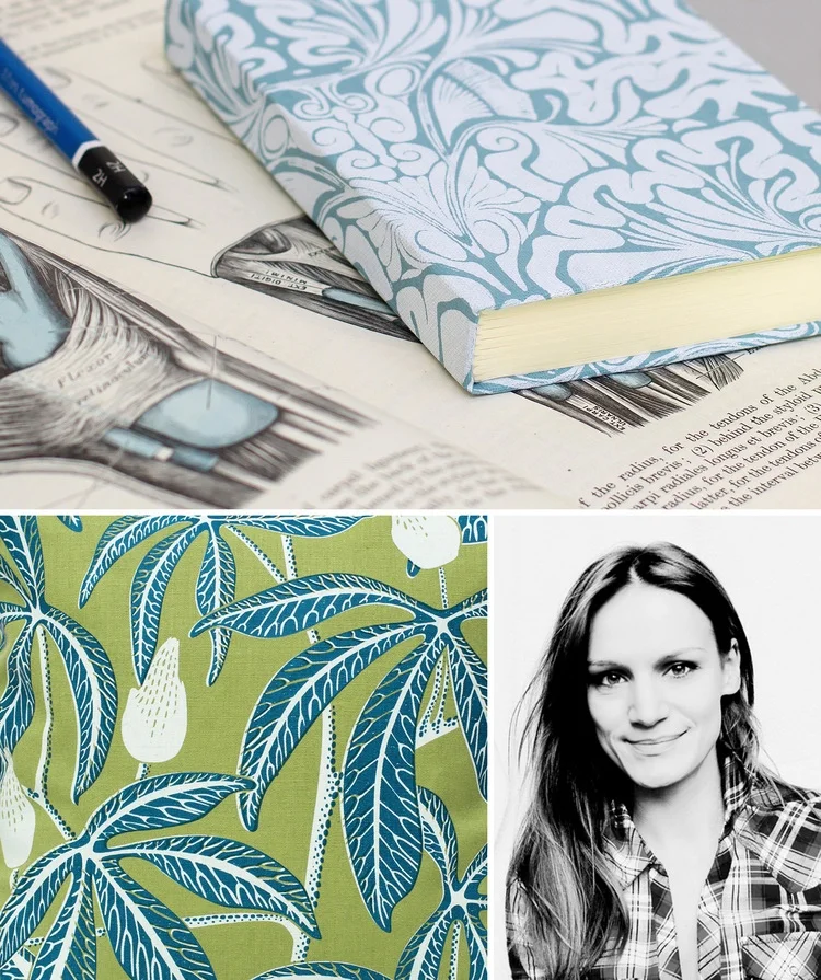
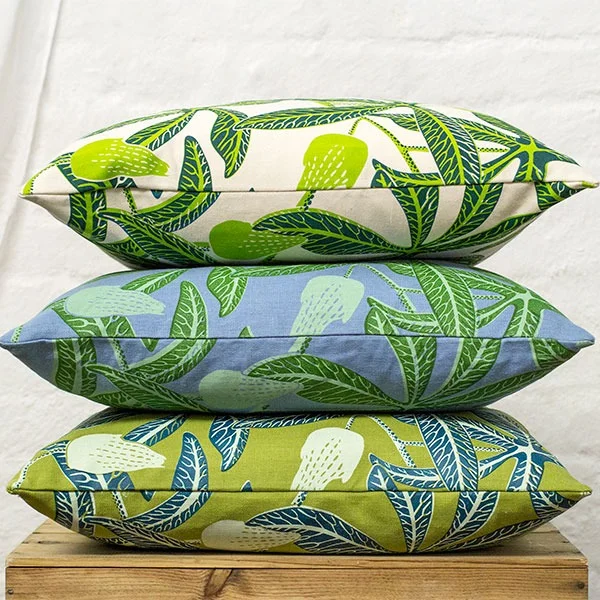
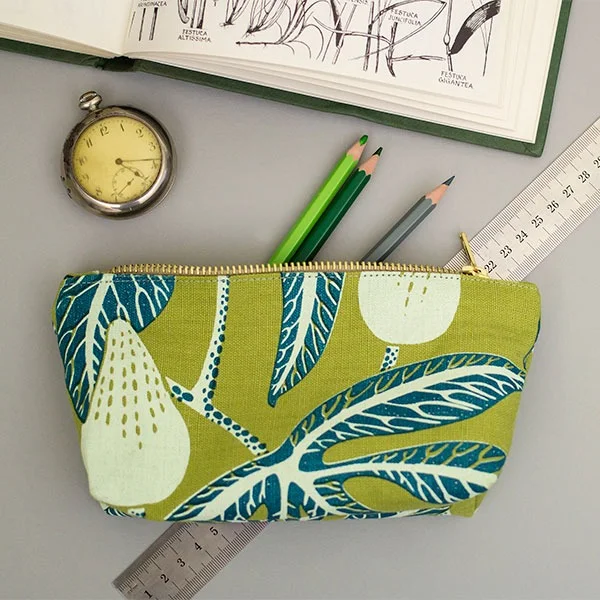
Fanny Shorter is a printmaker and designer who grew up in country town of Winchester, UK. Fanny is inspired by the intricacies of flowers and nature, and you can see her interest flowing through her work.  

“Nature’s never just attractive,” says Fanny. “There’s always something else going on. There’s a reason why a plant looks like it does. I like combing the fact that its aesthetically attractive with the fact that its interesting.” 

Fanny was trained as an illustrator at Brighton University, and she uses ethically sourced materials and water-based inks on all of her creations.  

Her work can be found on furnishings, stationery and accessories in her online shop

green graffiti & commuting beakerheads

photo by Neil Zeller 

Beakerhead is a new annual event held in Calgary each September. For 5 days, Calgary “turns into a giant laboratory” where Beakerhead visitors are entertained with public performances, contraptions built in people’s backyards, ingenuity competitions, and engineered art. Last year was Beakerhead’s first year and it was met with open arms by excited event-goers. "On the surface, Beakerhead looks like a week of spectacular fun every September. But it’s more than a schedule of mesmerizing events: it’s a time and place where engineers show their creative sides, and artists get technical, where science hits the street, and everyone gets ingenious,” say organizers. 

On May 23, Beakerhead organizers wanted to amp up excitement for Beakerhead 2014, so they worked with the City of Calgary and artist Michael Mateyko and Hans Thiessen, also known as Komboh, to develop “green graffiti” to paint on a Calgary underpass. The “green graffiti” is made of eco-chalk and is entirely environmentally friendly from the application to removal. 

Michael Mateyko is a Work/Life 3 participant and works and lives here in Calgary. I asked Michael a few questions about his participation with Beakerhead. 
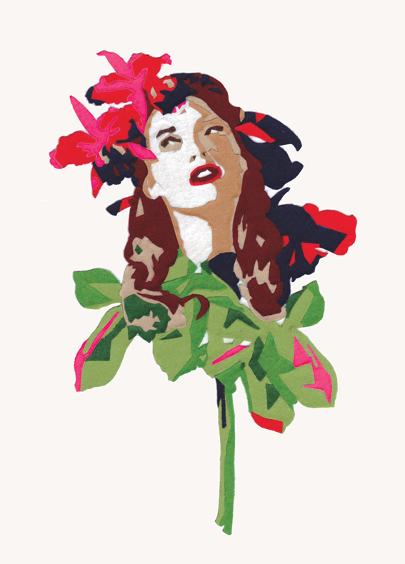
photo by Penny Breedon

What was your involvement with the "green graffiti" painted downtown? What was your role?

I came up with the commuting beakerhead(s) and designed the characters with feedback from the whole Beakerhead crew.

Who initially asked you and Hans for your help, and how did they know that you would be the right people to contact to help with this project? 

I was contacted out of the blue last year by Hanan Chebib, who is the Director of Creative Experiences over at Beakerhead. She somehow ended up with a poster I made and was pretty stoked on working with us on something. Our interests align pretty well; art, science, engineering, and trying to get people interested in the intersection between those three.
Had you heard of this "green graffiti" before you were approached to help? 

Not really. Originally the idea was to do a bit of pressure-washed reverse graffiti, but unfortunately (?) Calgary's underpasses are way too clean for that.

What do you enjoy about Beakerhead? What is your favourite "event" that you have attended? 

I actually didn't even get the chance to attend last year, but I'm definitely making my way down for 2014. I dig Beakerhead because it's really all about encouraging what by all accounts is a pretty conservative town to let loose and admit that we're all actually artists and engineers on the inside.

Did you attend the initial "green graffiti" event while the figures were being painted? If so, what was the experience like? What were passersby's
reactions to the graffiti? 


It was all being put up overnight, I believe around midnight or thereabouts. I had to do a TV interview at 5 in the morning the next day so I was trying to get as much sleep as I reasonably could and wasn't there for the install. During the photo shoot with the Mayor later the same day there was a pretty good crowd going and everyone seemed pretty pumped about it all. I received a lot of really positive comments from people that were just excited to see some public art that was a little weirder than usual. Also, Mayor Nenshi did his best to psychoanalyze each character in turn, so that was pretty fun too.

photo by Neil Zeller 

family snapshots of yesteryear by Rihannon Adam

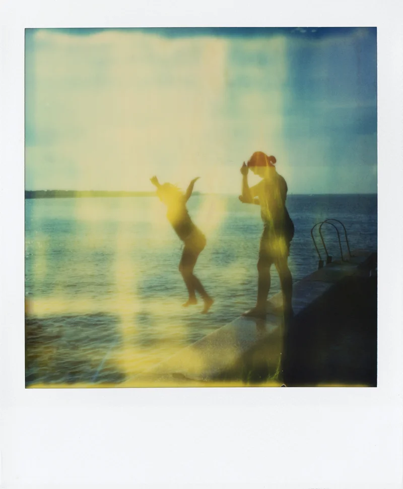
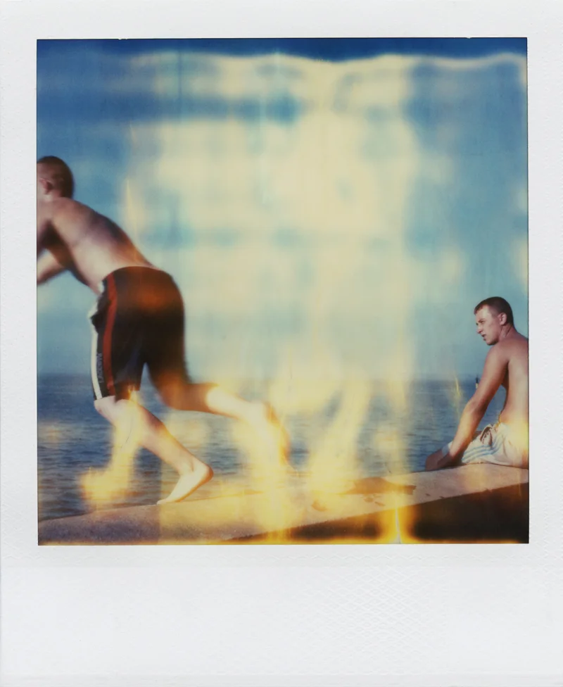
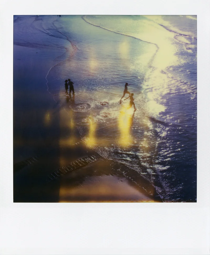
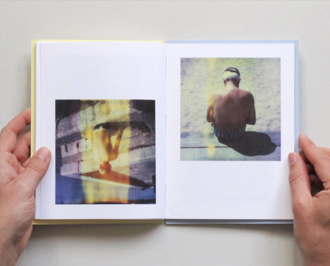
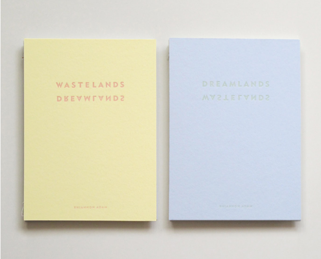
Rihannon Adam is an artist who lives and works in London, England. She attended Central Saint Martins College of Art and Design, and also the University of Cambridge. She recently released her new book called Dreamlands / Wastelands, a collection of photographs taken on expired Polaroid film in the resort towns of Margate and Benidorm.

"I’ve always been interested in 'the holiday destination', partly down to my unusual upbringing aboard our boat, Jannes. While sailing, we spent a lot of time in coastal holiday locations stocking up on supplies. Most people that we met there assumed we were on holiday, like them, rather than our nomadic existence being a lifestyle choice," says Rihannon in her book.

Here is an excerpt written by Rihannon from Dreamlands / Wastelands

"MARGATE Mar – Gate. Gateway to the sea. Though I hated living on our boat, I still love the sea and am always drawn back to it. It also hard to avoid when living in the UK – drive in any direction and you eventually hit water.

Somehow Britishness relates to being an Island nation, having an indefatigable spirit, and being determined to make the best of what we have. There is nothing more British than standing on a beach in gale force winds with your toes buried in cold clammy sand having a ‘good time’. Or sitting in a parked car with a thermos, the windscreen wipers brushing away the tears of another summer downpour.

Margate is a place that most of us have heard of. It is the poster child British seaside town, its name synonymous with childhood memories of swimming in water that's just a bit too cold, of buckets and spades, ice cream, deck chairs and donkeys. Its history riddled with familiar pairs: mods and rockers, Chas and Dave, Del Boy and Rodney, highs and lows, boom and bust. We all have our own Margate – you can find one on every British coast.

This project explores what is beautiful about Margate - then, and now. Shot entirely with expired Polaroid film echoing family snapshots of yesteryear, these pictures show what a good old-fashioned British holiday resort looks like on the cusp of resurgence. Polaroids imbue a cultural cellular memory and nostalgia for all of the millions of childhood moments spent ‘beside the seaside, beside the sea’.

The film is now extremely expired causing imperfections, bearing resemblance to the scars of passing time and memories transforming, blurring the boundaries between past and present. These effects also mirror the cracks and decay that permeate the walls of every British resort town. These photographs are my memories, your memories, our memories.

Even after a recession, a change in taste, and the advent of cheap flights and package holidays abroad, Margate is still beautiful when the sun shines." 

For more information on Dreamlands / Wastelands, click here

scrapbooked ephemera items by Mr. Ned

Mr. Ned (aka Ned Jolliffe) is an illustrator and designer from Oxford, England whose work can be seen on book covers, magazines and theatre posters. He has been compiling a scrapbook for about 10 years in which he pastes his collected ephemera items. "Juxtaposing a new bit or bob in its pages makes me very happy; It's not finished - there's lots of pages blank, and I fear the thing will disintegrate before I complete it,” says Ned.

"It's small, squarish little thing that has grown stout over the years from absorbing little ephemeral treasures as I trudge along the streets of wherever I happen to be at the time. My scrapbook is the one possession I would rescue from the raging flames."

To see more of Mr. Ned’s work, take a look at his portfolio here

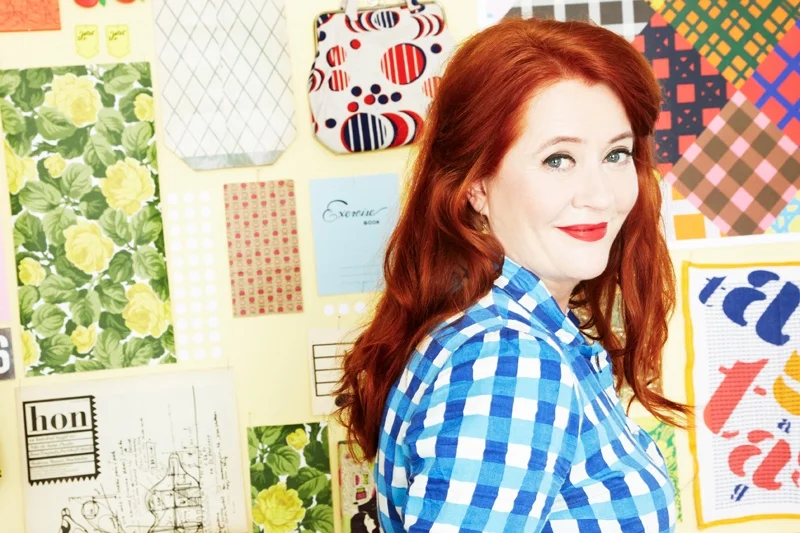
Swedish illustrator Lotta Kühlhorn


Lotta Kühlhorn is a Swedish illustrator who, at the age of ten, already knew that she wanted to be an illustrator when she grew up.

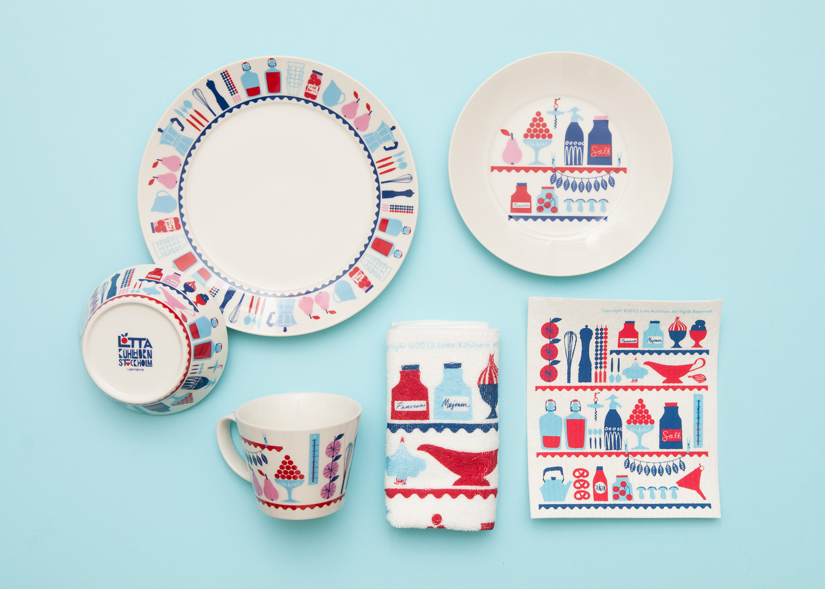
Lotta's illustrations and patterns can be found on cookware, books, fabrics, textiles–even wall tiles!

In January, Lotta released her book called Designing Patterns for Decoration, Fashion and Graphics.