Paul Octavious

It snowed yesterday here in Calgary. It made me think of this video by Paul Octavious (whom we featured way back in issue 4) and his project Same Hill, Different Day.  Paul is a prolific and inspired person. Need a lift? View more from Paul:

I've never been to an exhibit like  Ann Hamiltons:  the event of a thread before that had inspired me to no end. So one day I brought my parents and a camera and documented my experience. Music / Sufjan Stevens - Redford ( for Yia -Yia and Pappou) http://pauloctavious.com

A 60sec experiment with the color Indigo. Music John Brion - Spotless Mind

monday movies: invisible drawings: Grey Area

"Using homemade giant brushes and water as a medium, calligraphers practice their writing in the parks in Beijing. Inspired from this, Invisible Drawings: GREY AREA is part performance, part graffiti, and part social experiment.

Invisible Drawings: GREY AREA is a process-based, social experiment that aims to connect artistic practices across disciplines, nationalities and backgrounds within the fields of drawing and performance.

Using commonplace materials, public spaces and private spaces are utilized; the action of production becomes as important as the drawing itself. Spontaneity and improvisation are the methods of exploration in the creation of objects as well as ephemeral works."

"Over the course of ten days, we employed elementary materials such as industrial iron plates, rope, salt, chalk and charcoal,  and used the gallery space as pictorial surfaces through drawing and dance. Here patterns begin to emerge in terms of sound, observation, echo and erasure as well as gestural relationships. Through large-scale artworks, video and sound installation, fragments of performative gestures and live actions, we improvised mark-making and body movement. The public was invited to observe past and on-going performances; the realms of drawing and dancing became blurred."  

Thank you to Christine Cheung for submitting the link to her project site.

inventing kindergarten

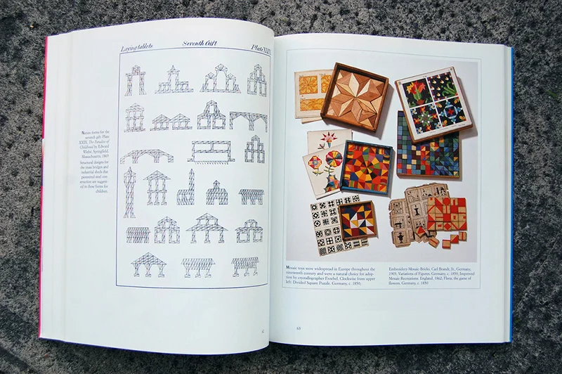
Inventing Kindergarten is a book originally published in 1997. It is an intelligent and visually inspiring history on the concept of kindergarten and the creative education of children. When I first purchased my copy, I was interested in it from a graphic design standpoint, such as the design and packaging of the "gifts" (levels of educational tools and toys invented in 1837 by Friedrich Froebel as the first "garden of children".) I actually purchased a second copy and gave it to someone studying early childhood education.

I own a soft cover of the book and shared photos of it back in 2008 on Flickr. Recently, I was contacted by Scott Bultman and the book's author Norman Brosterman who found those images and wanted to use some in their Kickstarter campaign to reprint Inventing Kindergarten. The book has been out of print for some time and the copyright has reverted back to the author. They plan on reprinting the original hardcover version. Find out more on Kickstarter.

creative calgary: wreck city

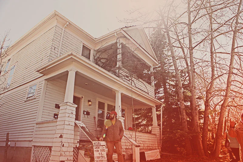
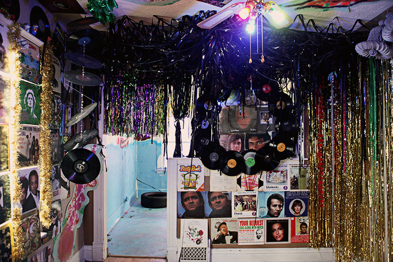
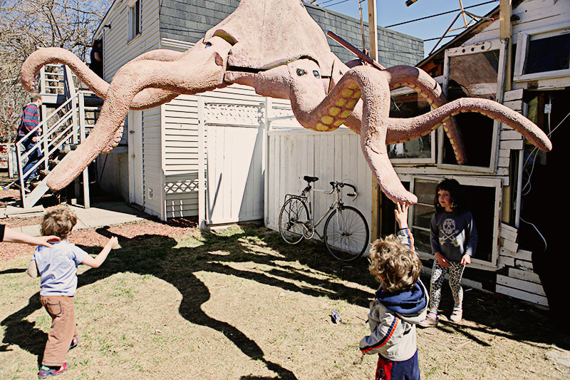
A row of houses in my neighbourhood is slated for demolition (seems to be a recurring theme) and a community of artists have transformed the buildings before they're torn down. We headed down to see Wreck City before this art installation project ends tonight.

Though it was certainly interesting to see something like this on mass scale and I can see how this was a fun project for lots of young artists to do whatever they wanted, it did feel a bit like a missed conceptual opportunity. Perhaps there could have been some way to comment intelligently on development (ie 'progress'), on respect for the past, on recycling and upcycling, on 'home-fullness' and homelessness... or the history of the houses? Who used to live there? How do they feel about their former homes being torn down? Where are they now?

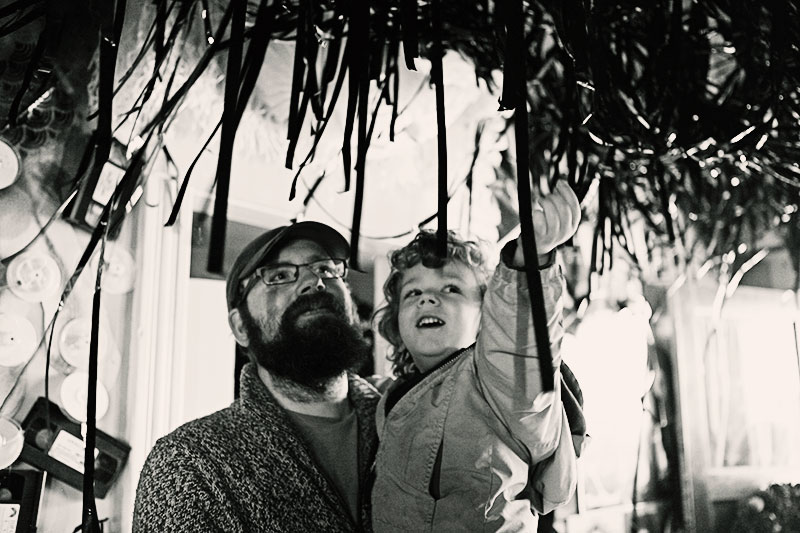
Maybe I missed some of these concepts as I held tightly to Finley's hand in some potentially hazardous spaces (for a curious 3-year-old)​ and juggled my camera. I'm not sure. (There was a house with a lineup and controlled entry that intrigued me but we couldn't wait in line.) The overall experience left me melancholic.

A commenter on the Wreck City site wrote something that I agree with:

"As a neighbour, I am glad to see the demolisher (aka Developer) interested in some of the neighbourhood’s culture by supporting WRECK CITY, however, I find it a bit funny that we’re going to have this influx of art and culture just to have the culture entirely wiped out by a colossal condominium spanning an entire city block in the heart of this heritage community." 

thanks for the thanks

Sass Cocker and Diesel

Our current issue features an extensive Stationery Guide with 50 profiled stationers and paper goods companies. Australian company Ask Alice is included and proprietor Sass Cocker emailed this fun image in thanks:

"Congratulations on another freakin' A-M-A-Z-I-N-G issue of UPPERCASE. I can't thank you enough for featuring Ask Alice... not once, but twice! It's a real honour for me. My cute Mum was teary eyed when I showed her and has since purchased several copies!"

Looks like her dog Diesel was a little too enthusiastic with the paper flag! (But we love to devour paper products, too. Like this lovely blank notebook with multiple found and upcycled paper stocks.)​

Thanks, Sass!​

arrow by Bryan McManus

Bryan McManus wrote in to share his video portfolio:

"My passion as a filmmaker is uncovering the beauty of the ordinary. Your magazine brilliantly pursues that goal and resonates with me to that end. It seems there may be some overlap in our vision — to highlight the simple and ordinary objects of life — and to uncover their underlying beauty, meaning, and presence to enrich life."

Check out some more intriguing videos by Bryan.

scratch 'n' sniff

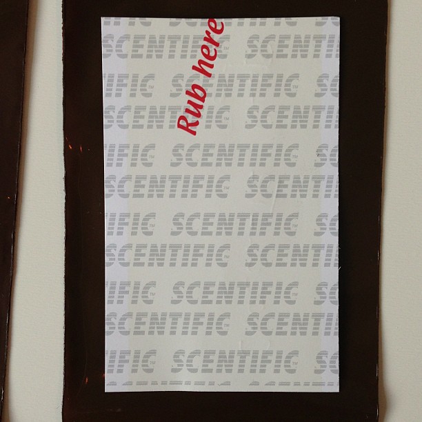
Janine sniffs the "lemon" card. Hmmm... a bit too detergent and not enough meringue!

Each scent was packaged in its own ziplock bag.

Apparently, this is very scientific.

One of the fun extras in the forthcoming spring issue (Issue #17, out in April) is an article about scented ink printing technology. We're going to include our very own scratch 'n' sniff area on the next issue so thorough scent-testing is required.

For those of you with a sensitivity to smell (I'm one of them!), don't worry—the scent is only revealed when the small area is gently rubbed and your magazine won't be smelly (except for that lovely fresh ink on paper aroma.)

art basel: inside manita and randy's apartment

Guest post by Rose Zgodzinski
Photos by Michael Vaughan

Randy and Manita

The best part of Art Basel for my husband Michael and I is the visit to Manita & Randy's Bayside condo. Manita Brug-Chmielenska is the reason why we go to Art Basel. She is an old friend from Toronto who relocated to Florida originally to investigate southern vegetation (when she was practicing landscape architecture). She found Randy Burman in a neighbouring studio, stayed, married him and became a principal in his graphic design firm, IKON Communications and Marketing Design.

For years Manita has been saying "You've gotta come down and see this! It is the Olympics of the art world! We've taken her advice and this year's annual trek to Art Basel marks our fourth visit. I would be lost without Manita's daily telephone debriefing sessions during Art Basel week—she is the indispensable insider's guide with advice on what to see, what to avoid, restaurant and even traffic and parking suggestions.

We always manage to get in a visit in to their apartment. This year Manita, has organized a morning brunch, in order for all their visiting friends (collectors, out-of-towners, artists) to get together.

Their amazing apartment, which has been organized around a burgeoning art collection (or "Living with our Obsession" as Manita calls it), has been amassing for the past 17 years and reflects their eclectic sensibilities.

Manita describes their collection as "Guided by intuition, personal preferences and sensibilities that lean towards Dada and Art Brut, we have surrounded ourselves with a collection of contemporary, thought-provoking, and often, witty art." The collection of 200-plus pieces consists mainly of found-object assemblages, but there are also works on paper, paintings, woodcuts, ceramics, books, collages, glass, sculpture, advertising icons, and photography.

Visiting the apartment is also an opportunity to catch up with Randy's own artwork; also found-object assemblages and an extensive portrait project of Republicans ("Somebody's got to do it!") for a conceptual arcade-like installation.

Miller Goodman at Piet Hein Eek

I have admired the work of MillerGoodman online—they produce clever and well-designed toy blocks for children (and adults) so I was excited to see their display at Piet Hein Eek. The assembled faces, above, are part of their book, Faces, which has been on my list for Finley. (And possibly a set of blocks, too, though we have so many toys that have lots of parts that I always seem to hunting for missing pieces.) Alas, lineup in the shop was too long and the break during Etsy presentations was too short. Good thing everything is available online in the MillerGoodman shop. { One more image on little U. }

girl crush: Shauna Alterio

ALL PHOTOS COURTESY LESLIE FANDRICH.​

The object of affection: Shauna Alterio (left) with some of the attendees.​

​Footwear crush!

Supplies for a creative afternoon.

​A glimpse into Shauna's idyllic work and living space.

This photo of Shauna courtesy Girl Crush.

Girl Crush is a series of small gatherings organized by the Jealous Curator (Danielle Krysa)​ where you can have a fun and friendly encounter with one of your favourite creative crushes. This past weekend, UPPERCASE contributor Leslie Fandrich took part in Girl Crush Philly and got to hang out with Shauna Alterio of Something's Hiding in Here, Forage and Seed House fame. To read about her experience, head over to Leslie's blog Lights and Letters.

Thank you Leslie for sharing her photos with us. And thank you to Shauna and her husband Stephen for inspiring us with their amazing work and for the contributions to UPPERCASE magazine. And big congratulations to Shauna and Stephen on this very special news!​

Jerry's map

Article and photographs by Gail Anderson

This article was originally published in issue 12 (January 2012) of UPPERCASE magazine. 
Video by Greg Whitmore (2009).

Jerry Gretzinger is a musser. "My mother called me a "musser" because I liked to mix things together," he says. "I once mixed ammonia and Clorox and then took a whiff. I invented games and forced my younger brother to play them, and then got pissed off when he won." Many of Jerry's games had their basis in maps, with fully operating railroads, airlines, and hotels. There were armies and wars. But saying that Jerry's maps have become considerably more involved since his Michigan childhood is a bit of an understatement. In fact, he's been chipping away at the same map since 1963, though he did take a break to raise a family. The map is now made up of over 2400 individual 8x10 sheets.

An example of one of Jerry's panels.​

"The map began as a doodle," Jerry says in Greg Whitmore's 2009 documentary trailer — a sudden viral hit on Vimeo with almost 100,000 hits. "I just made little rectangles and crosshatched them carefully." Using typing paper allotted by his mother sparingly, Jerry began to create a city, and soon, countries with their high-speed monorail lines, freeways, and void defense walls (more on the "void" later). With each new panel, Jerry's world expanded.

Jerry’s various logs include books that document parishes, populations,and other vital statistics. He occasionally makes copies of map panels available for sale on eBay.

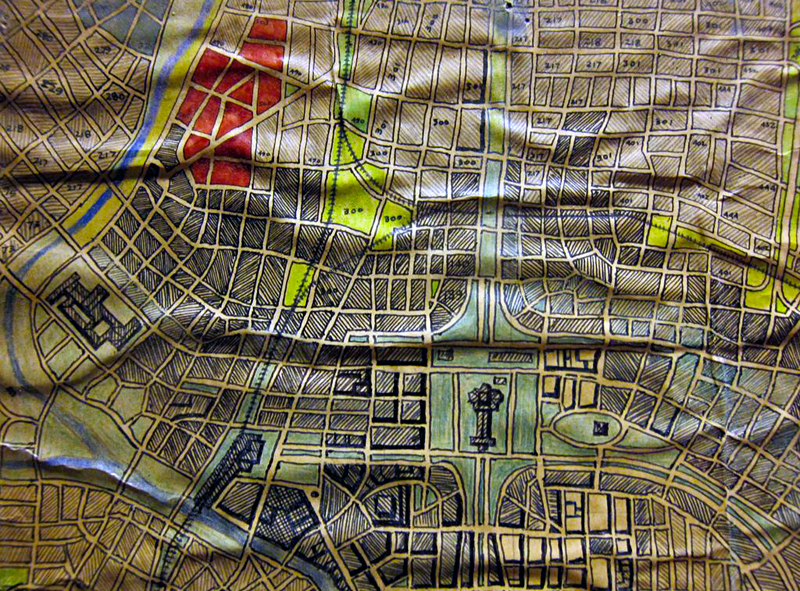
​The detail of one particular panel.

"Not only does he build his world, he also destroys it," a Vimeo fan writes on Jerry's page. "What I found most fascinating about this was that my preconceived ideas of what he was doing changed every 30 seconds as I discovered just how deeply into his world he got." Jerry is into his world in a big way, with over 2400 completed map panels methodically categorized on metal shelves. The stacks represent almost a half-century of evolution in his virtual world.

Jerry, 69, begins each day in his Cold Spring, NY basement with some early morning map time. He and his wife, Meg Staley, are working on their next life chapter, having sold the clothing company they created together, Staley/Gretzinger, about seven years ago. They divide their time between New York and their 100-acre working farm in Maple City, Michigan, where Jerry tends to sheep, goats, chicken, and turkeys. "I don't feel deprived in the least without television when I'm at the farm," Jerry says as I clutch my chest in horror. "I get pretty unplugged when I'm out in Michigan. I'm in the garden a lot."

"When I first met Jerry he was living with my sister in an illegal loft in a former thread factory in SoHo," Jerry's sister-in-law, artist Lynn Staley recalls. "The venue itself was unconventional enough, but Jerry was in the process of papering the long hallway leading to the living space with bits of torn New Yorker magazines. Not the pretty covers, mind you, but the black and white text pages punctuated by an occasional cartoon. You'd be talking to him and he'd be papering, homemade paste pot in hand, as if it was the most normal thing in the world." I met Jerry through Lynn in the late 1980's, and was completely taken by his good humor and eccentricities. But I had no idea about the map until only this past summer. And now, even Oprah's a fan since it was recently featured on her website — the ultimate seal of approval.

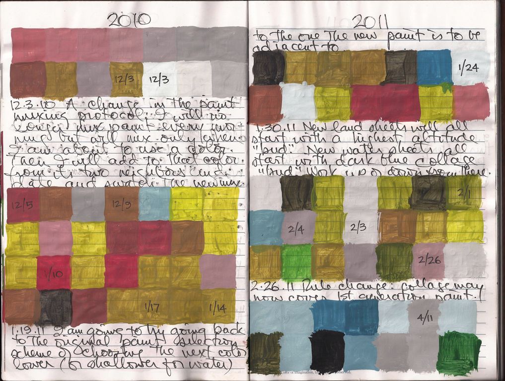
Organized paints, with the colours and dates indicated on the cap.

Each morning before sunrise, Jerry re-tints his colors. Two rows of small plastic bottles are lined up in sequence on a large table in the dark, low-ceilinged basement in the Cold Spring, NY, house that he and Meg share. Jerry listens to music on Internet radio as he begins his morning ritual, adding notes and sample chips to a massive, one could say, "obsessive" color journal. Next, Jerry draws a card from the bottom of a deck of elaborately retooled playing cards that dictates how many panels he moves in the rotation; which panel will be worked on next. There is mind-boggling ritual involved in every step — logging elements into a spreadsheet in now-obsolete HP software on a computer that's missing part of its case. "The housekeeping takes so much time that the execution suffers," Jerry says with a smile. One day, he's scanning and reworking an archival page, and the next, he's forming parts of a new world. 

Jerry began mixing new paint colors around 2003, and documented them in this ongoing journal.

"I love the interplay between what's out there and the map," Jerry says. "Anything goes. Yesterday, my little cheap printer was running out of ink and was giving me totally mis-colored prints. Still, they get incorporated into the map. Then, my younger grand daughter scribbled on one, and that became part of it. I encourage people to touch and feel the map, and not to be shy."

Jerry started using his most recent cards around 2003, though the system dates back much earlier. He is protective of maintaining the cards’ order, and seemed slightly concerned when I had them on the table. They are as beautiful and quirky as the map itself.

One of the most intriguing aspects of Jerry's map is the structure and rules he imposes on his virtual world, complete with implications of destruction. For example, there's a "void" card. When Jerry draws it, all bets are off — entire countries are sometimes wiped out, and new worlds emerge from the ruins. The ritual appears to have been created to expunge Jerry's own creative process; he becomes simply the executor of the cards' fastidious dictations rather than the architect of a vast universe. The randomness of the card's instructions helps Jerry maintain the vitality and evolution of his world, and/or can lead to its destruction. By contrast, many outsider artists attempt to compensate for their lifelong instability by constructing a comprehensible world that is completely fictitious. What Jerry Gretzinger has done instead is to build in the possibility of total destruction to his virtual world, which actually makes it beautiful. 

"Jerry's willingness to bend, adapt and break his own rules extends freedom to the map itself," says filmmaker, Greg Whitmore, the creator of Jerry's documentary trailer. "I should add that though Jerry is permissive and liberal when it comes to the process, he is dogmatic in one regard: that this 'thing' is, in fact, a map and he is responsible for it."

The original map was mounted and preserved on cardboard about 40 years ago. It is now yellowed, but still fascinating in its complexity.

Jerry is able to abandon himself to the randomness of his map, which, ironically, he's designed himself, choosing all of the variables. For example, a limited color palette means that there can only be a certain amount of disharmony. In aggregate, the work is remarkably integrated, and therefore breathtaking in its scope. And it's just a little crazy — but that good, quirky crazy that you can't help but love.

The map has never been displayed in its entirety*, and no one, not even Jerry, knows what his world looks like. "Even he is powerless to say what the outcome will be," says Lynn Staley. "So not only is there great beauty in the map's texture and variation, there is potentially galactic suspense. Will this place, whatever it is, survive or be consumed by the void? What about its inhabitants? And what can we learn from it about our own fate? Is there someone somewhere with another deck of cards like Jer's?"


*This article was originally published in issue 12. The Massachusetts Museum of Contemporary Art has been preparing to mount an exhibition of the project, A Half Century Project of Imagination, on view October 5–14, 2012.

We Should Know Each Other

​We Should Know Each Other made for a fun afternoon. Thank you to Erin and Eleanor for helping our visitors make buttons and beaded necklaces. I enjoyed taking some photos of the event, but more specifically how the former school is being transformed into an arts incubator space.

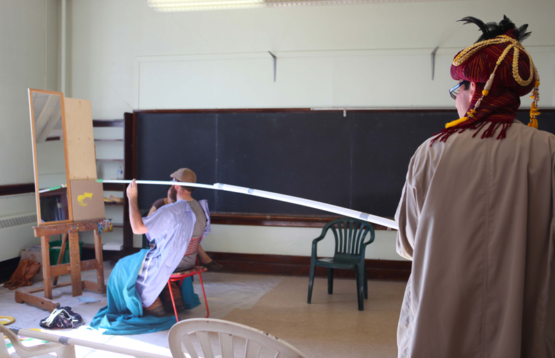
​UPPERCASE shared classroom 309 with Gary McMillan, or rather "Maestro McMillan, Ouija Self-Portrait Mediator" aka painter with a very long paintbrush. (Or "finglonginator" if I may use a Futurama reference...)

​The notion was that Glen, seated, would subconsciously guide Maestro Gary during this portrait session.

​Glen kept his eyes closed throughout the session.

​The resulting painting had a likeness of Glen, except for the angry eyebrows.

​Paint spatter and dribbles are part of the process.

Though UPPERCASE won't be participating tomorrow, WSKEO is still in full swing on Sunday, so please check out the event at the old King Edward school.​ Calgary is hoping with activities this weekend, so my family and I will be enjoying Heritage Park's Train Days tomorrow.

nuit blanche

There's an intriguing event happening this Saturday​... Nuit Blanche Calgary:

Nuit Blanche has come to signify a late-night international contemporary arts festival appealing to diverse, adventurous audiences. Held worldwide since 1997 in Toronto, Paris, Halifax and other cities, Nuit Blanche festivals literally transform urban spaces into full-scale civic art galleries. Calgarians will extend the tradition of the Nuit Blanche festival by presenting socially engaged intimate encounters with live art that fuses the authentic with the fantasy of an island of understated spectacle. All performances are inclusive, playful and geared toward a mass, all-ages audience.

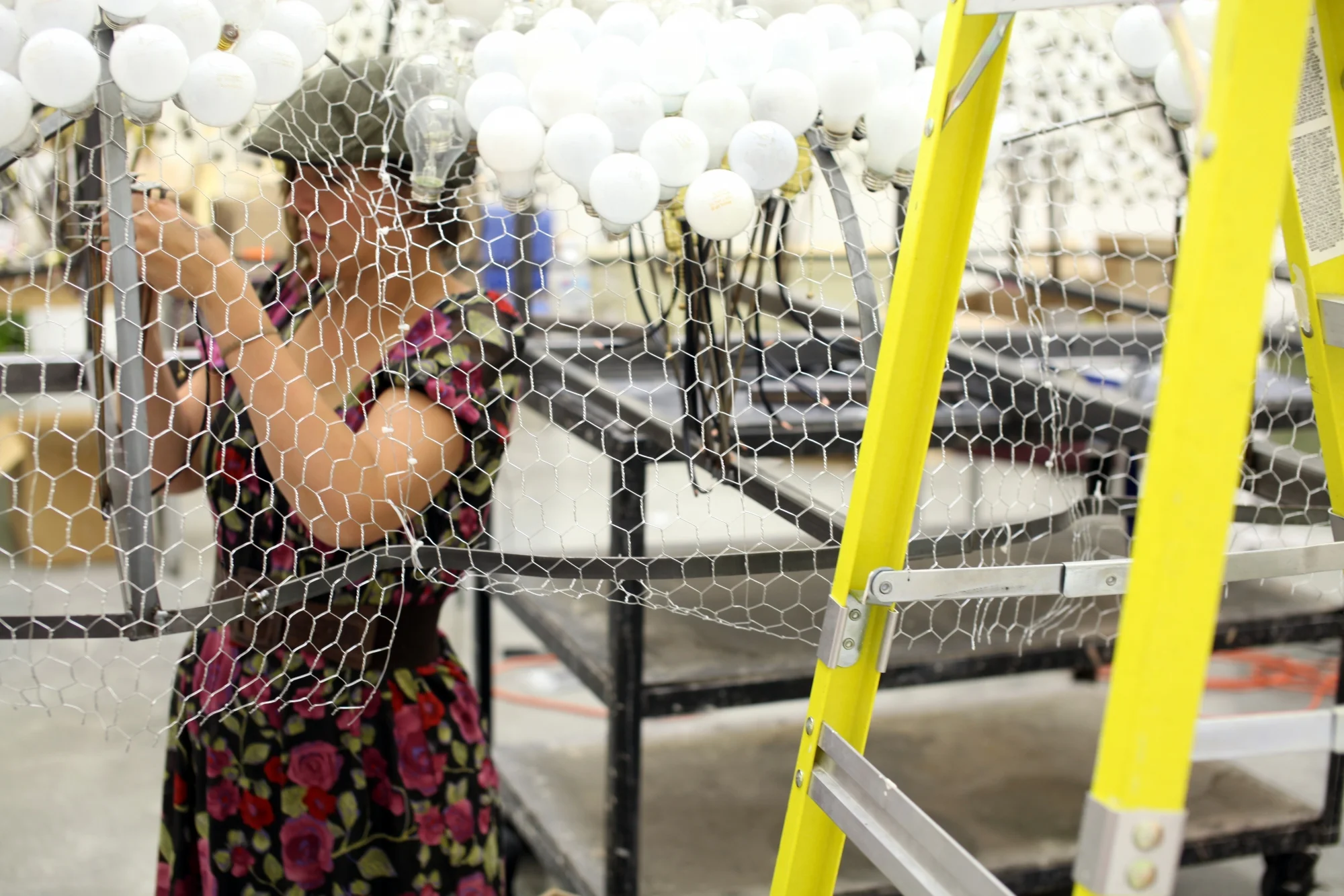
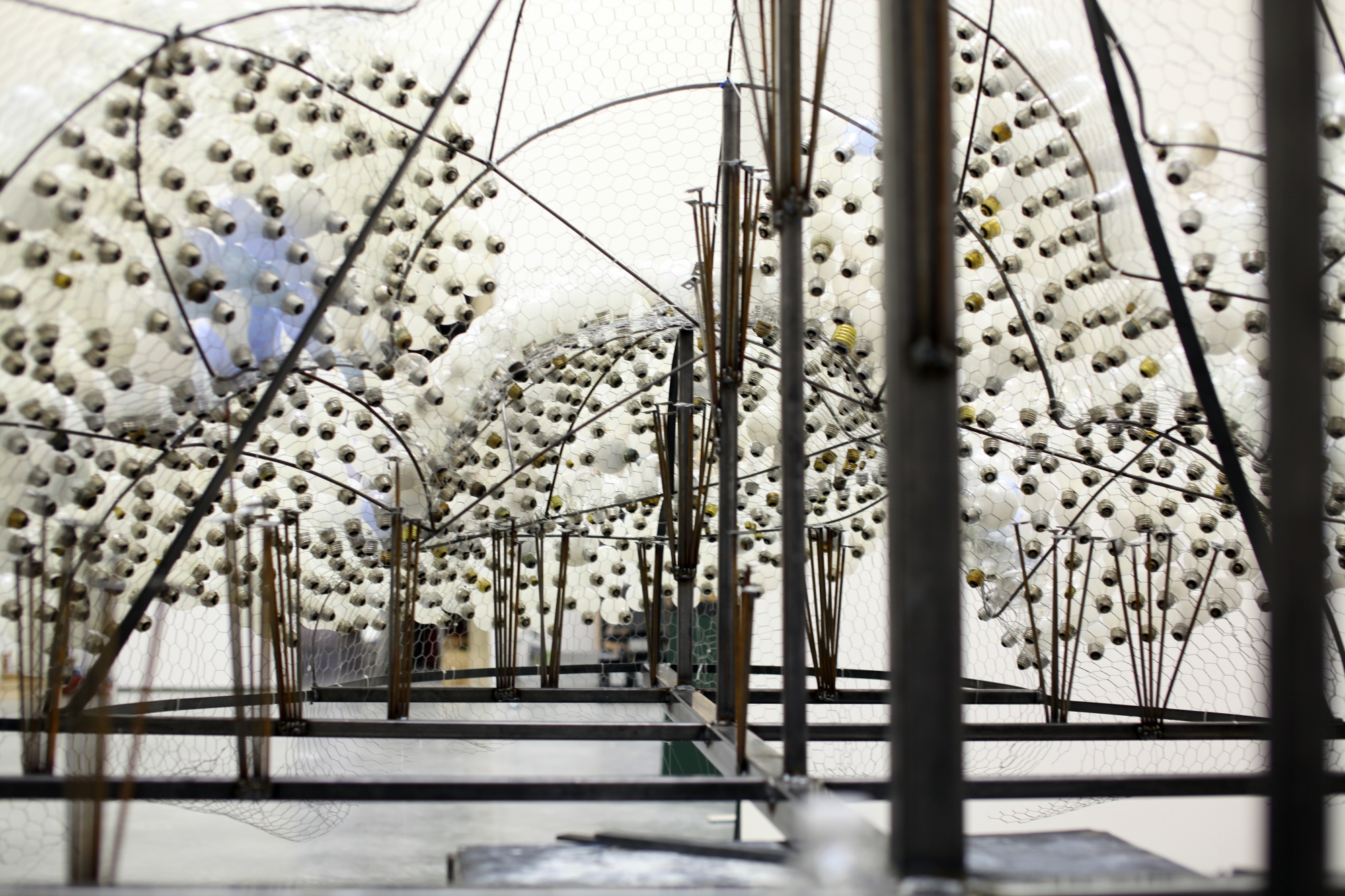
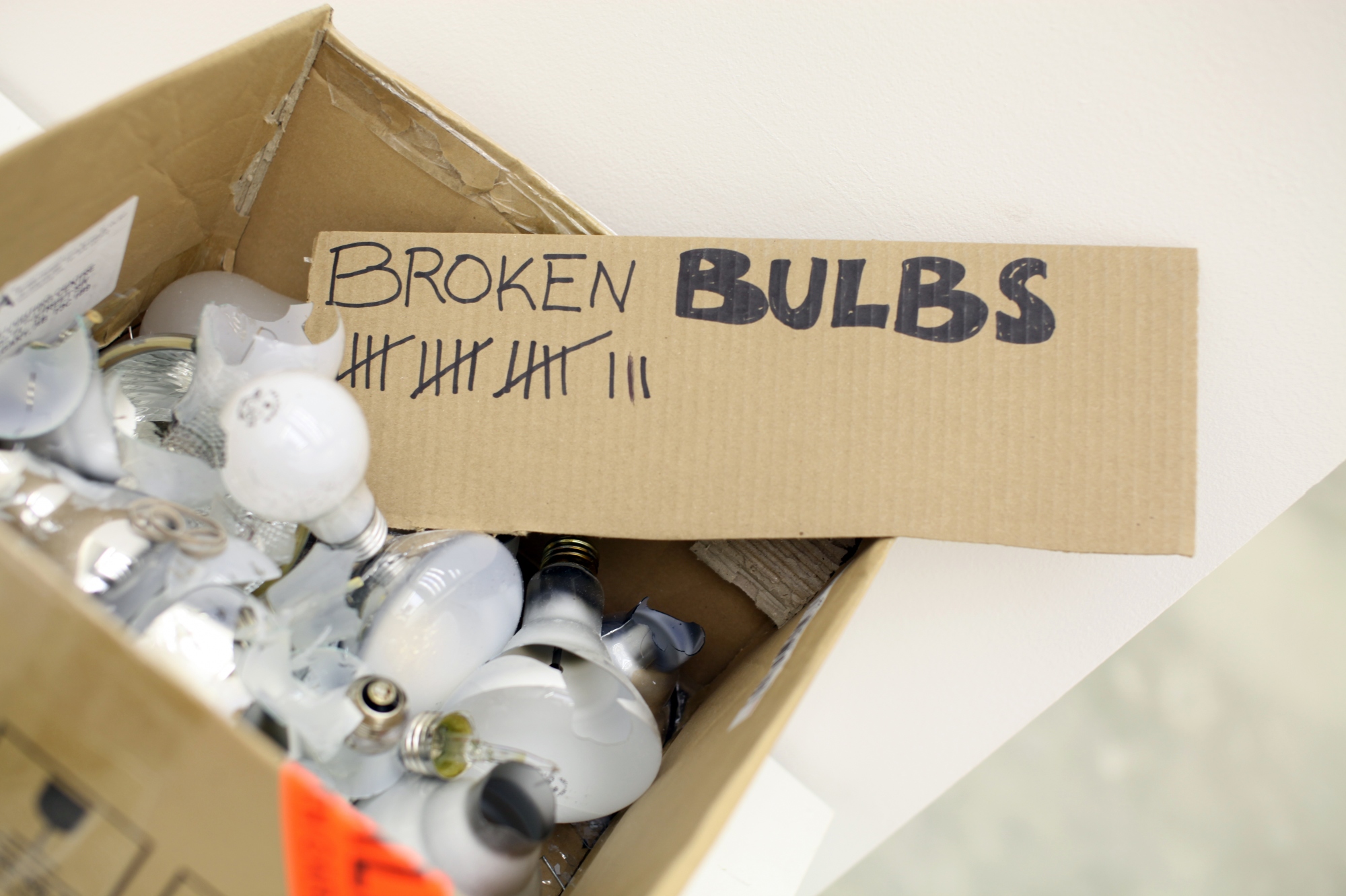
I'm particularly interested to see Caitlind Brown's Cloud installation. Made of over 5000 collected burnt out incandescent bulbs meshed on a chicken wire and steel structure, to be backlit Saturday night. Golden chains hang from the structure, inviting participant viewers to pull lights on and off. Caitlind's process photos are terrific; please enjoy a selection below and visit her project blog. Calgarians can head on over to Olympic Plaza Saturday night. ​

Mrs. Drysdale's Circus

I received this intriguing press release about a show by the Blue Horse Folk Art Gallery and wanted to share it with you verbatim:​

After touring the hinterlands for several years, Mrs Drysdale feels her troupe is ready for the Big Time. The first public performance in the great metropolis of Vancouver will take place in the heart of downtown, at the dramatic Pendulum Gallery. As a result of her world travels, she has assembled many new, exotic, and never-before-seen, acts. For example - Jacque Pierrot the Cat MasterBunny Bishop and his Wing Walkers, and the World's Only Tapir Race! The troupe is privileged and honoured to be performing for the sophisticated Vancouver audience! Once again, we emphasize, they must be seen to be believed. Do not fail, if possible, to be among the number at our opening reception, Thursday, September 13th, from 6 - 8pm. RSVP on our Facebook event page!

Show Schedule: Monday, September 10th to Saturday, September 22nd, at the Pendulum Gallery in Vancouver (885 West Georgia Street across from the Vancouver Art Gallery).  

​Sounds like a fun event for those of you in Vancouver!

&

​Gemma Correll

​Gemma Correll

This week's final post from our image hunter Shelley Davies ​is all about the ampersand. Visiting the sites of our two ampersand artists is a great Friday trip down the rabbit hole. Gemma Correll's site is full of cute rollovers and fresh content. Anna Raff's Ornithoblogical may be hard to spell but is a delightful image-based blog that 'showcases the birds on her brain'.   

Anna Raff​

Anna Raff​

We did some research on the origins of the ampersand and found an article on typography.com ​that is a nice way to end this post.