Beautiful Books by Bari Zaki

UPPERCASE reader Bari Zaki makes these gorgeous books using traditional European and Japanese techniques. In addition to blank books, box-making, she also binds photography portfolios and photo albums.

Bari writes:

I have been a hand-bookbinder for 25 years and so your recent newsletters had a particular resonance with me. My career began with a simple yet intense curiosity; I saw a blank book that was made by hand and it sent my heart into a pitter-patter of delight… How do you do that, I wondered?!  I went in search. Since then I have made literally hundreds of books and have several stacks of them in my home, which have become permanent fixtures.

"Many people say to me that they love my books but they are too special to write in… I hear that a lot in fact. I thought about scribbling on the first page as an ode to making the first mess, so to speak." Whether they are left blank to be admired for their integral beauty of form and construction, or filled with sketches and notes, Bari's books live up to the ultimate goal of any book: to inspire.

Visit Bari's shop to see more. 

"Colour is the first thing my eyes see and comprehend."

Many of the colour submissions that I've shared in the magazine or in my newsletters are definitely in the realm of the tactile such as paint, paper and fibre. But most of us are also creative with our digital media. UPPERCASE reader Paloma Diaz-Dickson shares her digital palettes with us.

"With the flood of art and design images available to browse on the internet, I find myself liking or disliking pieces usually based on the colour choices. Colour is the first thing my eyes see and comprehend before I look closer to distinguish shape and content. I started collecting colour palettes that draw me in, and in turn, that Photoshop file is the first place I look before starting a project. Sometimes I'll choose an existing palette, sometimes I'll modify it or combine two or more together to get the effect I want. Colour is the source of all my inspiration."

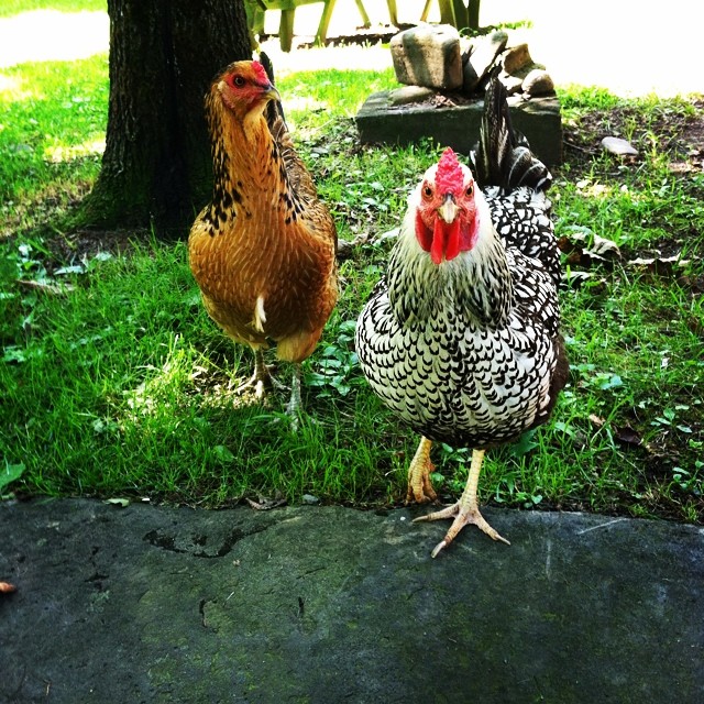
#uppercaselove: Stephanie Brockway

I'm really enjoying the colourful photos of issue 22 coming through over Instagram! (Remember to post the photo with @uppercasemag #uppercaselove so that I can find it easily.) The image above, by Stephanie Brockway, caught my eye. I chuckled that her third most recent photo was of chickens (chickens are three degrees of separation from UPPERCASE?), so I put her latest three images here to show the sequence.
Reader pics: Tiffany Pratt

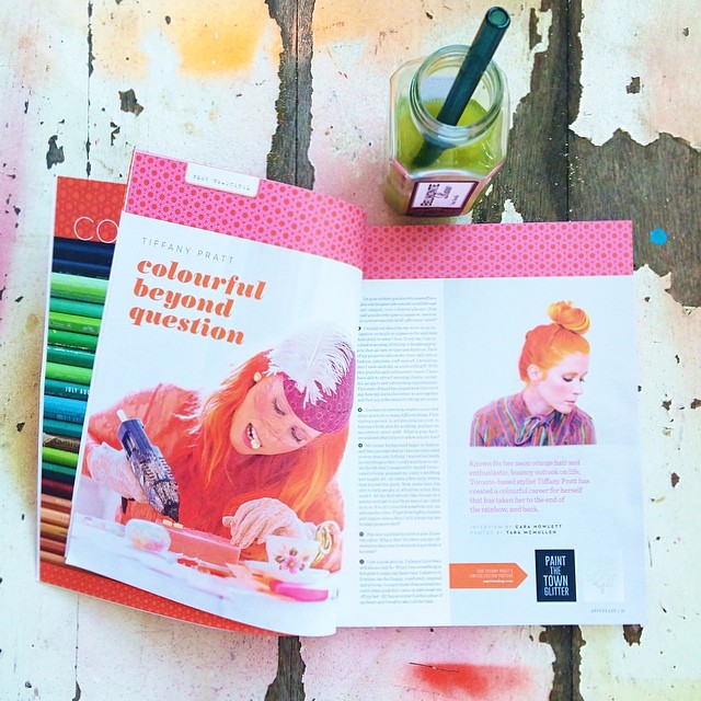
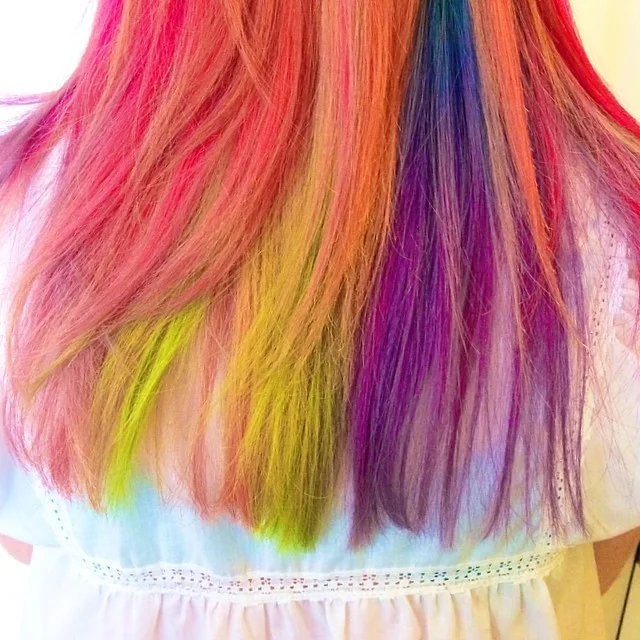
“Colour is life energy and one of the most powerful pure forces. It is the air that I breathe. How and why I choose certain colours is deeply personal for me, and I do it with a lot of purpose. I associate people with colours, I see experiences and moments through colours and I always dream of colours. This is why I need to create, make and design. Colour acts as the road map through my life and sets me apart, making who I am and how I see the world special.”

Read all about Tiffany Pratt in the current issue and follow her colourful Instagram here.

Prints & Ink


Melanie Yugo is the creative director of Spins & Needles, a record label and screenprinting studio in Ottawa. She and her partner Jason Pelletier have an multi-disciplinary event happening this weekend that sounds interesting. I'll let Melanie do the talking:

"We've been subscribers of UPPERCASE Magazine for a couple years now and have discovered the work of lots of emerging and established artists in print and design because of it. Also love that you're a Canadian bringing your perspective to the print world! 

Prints & Inks is a new celebration of the diverse field of print and graphic arts in Canada's capital. This weekend-long show will feature the work of exciting Canadian talent in print, illustration and design, alongside a pop-up shop, hands-on print activities, and a late-night art party. It takes place from June 20-22, 2014.

It'll be like art + design show meets DJ party meets interactive print workshop. 

Our motivation was to bring together the work of amazing Canadian talent from across the country in the capital. Many are showing here for the first time. It's also a space for people to learn more about these artists as well as creative processes like printmaking and illustration. This is our second instalment, and we are aiming to make it an annual event.

More about us: We're a music + making duo who produce events, including DIY + DJ parties, workshops, art shows, installations, and also run an indie record label. We're based in Ottawa but travel to different cities during the year for events."

Check out the Spins & Needles blog for studio tours and interviews with printmakers like Jenn Kitagawa, an Alberta College of Art & Design graduate whose work has appeared in UPPERCASE.

And, while we're on the topic, I'm working on printmaking as a theme for a forthcoming issue of UPPERCASE magazine, so if you'd like to share your work with me, please submit here.

I've been spoiled by Kim Welling

I have to say that one of the nicest things about UPPERCASE readers is their generosity. Not only do you share your work with me in each and every issue, but your tweets and instagram photos and emails of compliments and suggestions are very much appreciated. I am also completely spoiled when it comes to getting amazing mail from all over the world.

Kim Welling, an illustrator from the Netherlands, surprised me with this beautiful plate for my birthday. (You can read our profile about Kim here.) The lady on the plate resembles me a bit—I'm not sure if that's on purpose!—but I'd definitely love to dress like her with that stylish cape and fashionable envelope purse. Thank you, Kim!

illustration by Kim Welling for Flow Magazine

illustration by Kim Welling for Flow Magazine

Kim just launched a new website where it is easier than ever to appreciate the great work in her portfolio.

Winter Camping by Kim Welling

Winter Camping by Kim Welling

make your mother cry

One of the most memorable emails that I've ever received describes a funny and touching moment of a mother and son enjoying a copy of UPPERCASE magazine together:

My first issue came in the mail the other day and it's gorgeous! I'm so happy I subscribed. A colleague was teasing me with a couple of back issues she picked up, and I've been drooling over them ever since. Now I have my very own!

But I have to share a funny little tidbit with you. My college-age son, although he's a math/science kid, LOVES beautiful design. He came home for the weekend, and I showed him the issue. He cried. I kid you not. He opened up the book and was moved to tears by the totally awesome design. And then of course, that made ME cry. LOL So there we both were, all verklempt, looking at your magazine, weeping tears of joy.

So thank you for doing what you do! Now you can legitimately claim that your magazine is so wonderful, it moves people to tears. :-)

Sincerely,
Stephanie

Share your colours and be published in UPPERCASE

Shae Leviston's paint palette

Shae Leviston's paint palette

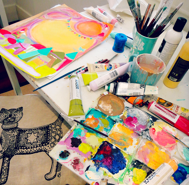
For our summer issue, we're asking you to show us your colours. Paintboxes, dirty brushes, crayons bits, dusty pastels... our colourful tools tell a story about who we are as artists. The call for submissions is open to everyone—whether you're a professional illustrator, a seasoned artist, an art student, a dabbler... what does colour mean to you? 

Shae Leviston, an artist from Australia, submitted her paint palette (against a white background, as we request in our call for submissions) as well as examples of her work in progress. Great submission, Shae!

Shae writes: "As an artist colour is my whole world. Through my art work I can express myself in colour in infinitely more ways than words. In acrylics I can mix up every hue and show my emotions, inner world and imagination in the most subtle or wildest ways. As an intuitive artist, acrylics allow me to work quickly, work on varying surfaces and add so many other mediums to it to create collage and mixed media work. Through colour I can create the paintings that bring people joy, awaken their inner child and evoke delight and wonder."

Please review the submission guidelines here and submit soon. The deadline is May 1. (That's next week!!!)

Call for Submissions: Issue #22

photo by Geninne Zlatkis

What does colour mean to you?

Take a photograph of the colour media that is special to you (paint palettes, paint, trays, pastels, crayons, pencils, inks, pigments, etc) and write a brief description of how and why this art supply goes beyond being just a tool or medium. How does it enhance your creativity? What makes this particular medium special to you? How is colour tied in with your identity as an artist?

SUGGESTIONS 
• Take a photo of your favourite media in good natural light against a white backdrop to show the object or artifact in its entirety
• Get up close and personal with some detail shots highlighting colour and texture and labels
• Provide a wider view of your workspace and artwork, showing your art supplies and various colours

Images should be RGB jpgs at least 6 inches wide at 300dpi. Please title the files with your last name. To submit your work, click here.

DEADLINE MAY 1, 2014

connecting creatives around the world


Talia Tordjman is an artist and professor living in Israel. In 2012, she documented the moments in her life leading up to her 50th birthday on her blog My Countdown. She had included UPPERCASE magazine in one of the moments and so we did a little mention on our blog. Through this post, Alba Bici discovered Talia and an online friendship was formed.

Recently they had the chance to meet in person, with Alba making the trip from Italy to visit Talia in Tel Aviv. "Our common denominator was UPPERCASE. We are both passionate about it," says Alba. 

We're happy that UPPERCASE played a small role in this story of friendship without borders. 

Typewriter Notes

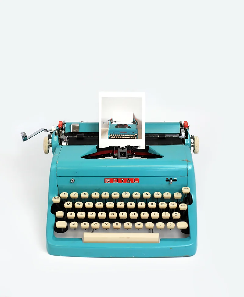
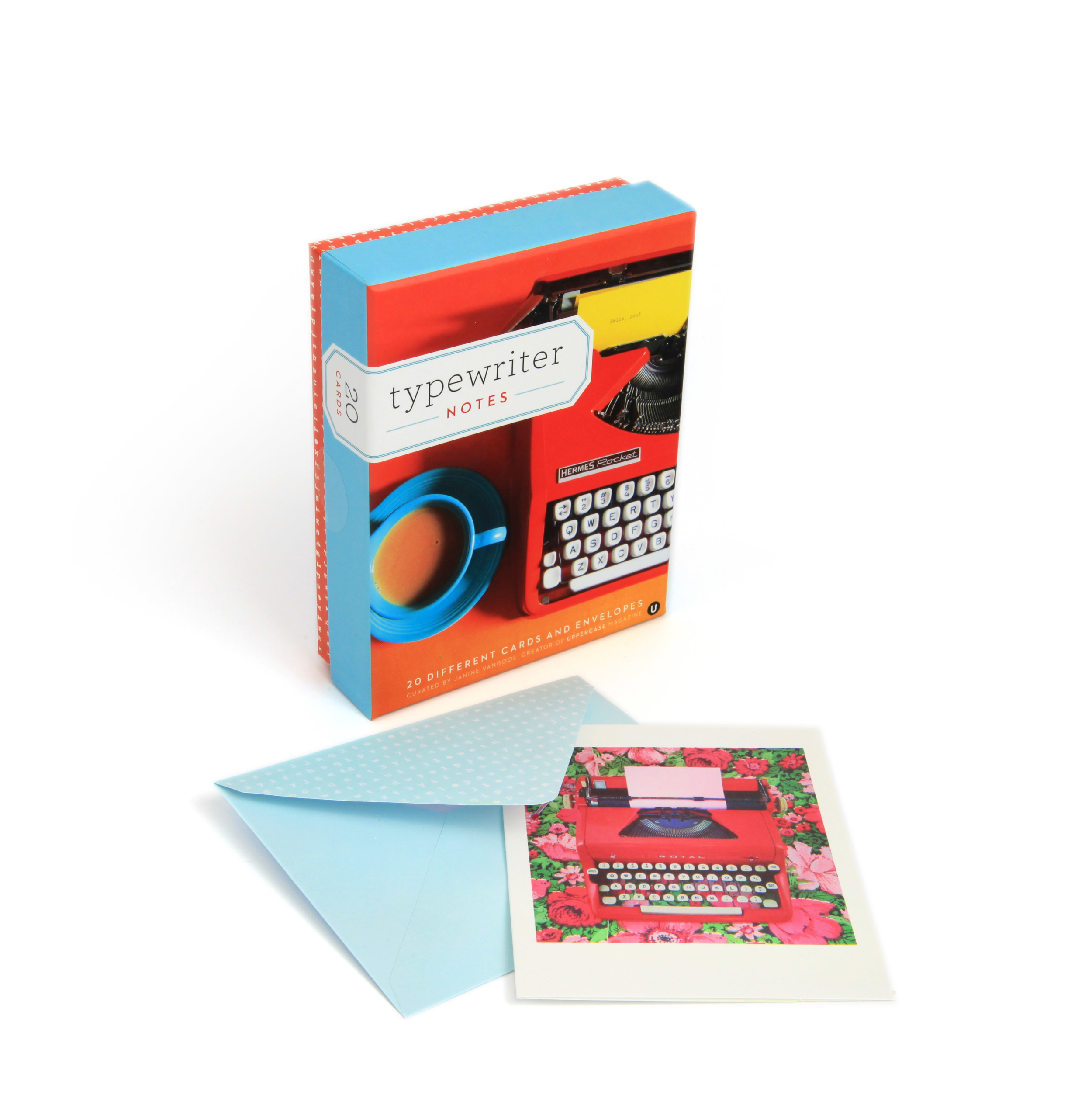
Typewriter Notes is a box set of 20 different cards capturing the timeless appeal of the typewriter. Published by Chronicle Books, I curated and designed the set. It features photographs by UPPERCASE readers. The cover photo is by Jane Bernstein.

In addition to a few of my own photos, there are photographs by Brianne Walk, Andrea Corrona Jenkins, Cari Wayman, Celina Wyss, Cori Kindred, Denise Regan, Jane Bernstein, Joanna Brown, Sarah Book, Shelley Davies, Svenja Schulte-Dahmen, Tracey Ayton and Vanessa Pham.

Thank you to Caitlin and Kristen at Chronicle Books for being so lovely to work with!

Sets can be purchased in our online shop along with Shoegazing Notecards, a previous collaboration with Chronicle. Thanks!

Mary Fisher's "100 Good Deeds"

post by Cara Howlett

Artist Mary Fisher was featured in issue #12 (2011), showcasing her talents in jewelry-making, sewing and weaving, as well as designing fabric and making paper. Besides her work as an artist, Mary is known worldwide for her role as a HIV/AIDS activist. After finding out she was HIV-positive over 20 years ago, Mary has used her art to help others affected by HIV/AIDS.

In 2000, Mary was asked by the White House AIDS office to travel to Africa on a fact-finding mission. While in Africa, Mary identified with the stigma attached to women with HIV/AIDS. Mary started ABATAKA, a foundation dedicated to helping these women. About 30 women hand-craft exquisite bracelets using Mary’s designs—thereby learning how to support themselves and becoming self-sufficient business women. 

Following the release of her memoir Messenger in 2012, Mary met filmmaker Thomas Morgan. He and his family created a game in which they would perform 100 good deeds anonymously. After learning about Thomas’ game, Mary responded by creating the 100 Good Deeds bracelet. Each bracelet is hand-braided by vulnerable women worldwide and strung with one hundred glass beads and a single rubber ring. After wrapping it around your wrist, each time you do a good deed, you move the rubber ring one bead closer to the 1GD charm. With every purchase of a 1GD bracelet, one vulnerable woman is employed giving her dignity and freedom. 

The 1GD bracelet is available in ten colours and may be purchased at 100GoodDeeds.org.

Since issue #12 is sold out, you can read the original article about Mary Fisher, written by Christine Chitnis, by clicking here for a pdf.  

creative manifesto: Alessandra Lanot

In our current issue #20 (released in January), we had a creative challenge asking our readers to submit their Creative Manifestos. Today we will feature some of the best submissions.

My Creative Manifesto: Follow Your Art

Your Name: Alessandra Lanot

Your City: Quezon City

Your Country: Philippines

Your website: http://www.lifeafterbreakfast.com


creative manifesto: Jane Rainwater

In our current issue #20 (released in January), we had a creative challenge asking our readers to submit their Creative Manifestos. Today we will feature some of the best submissions.

My Creative Manifesto: Beautiful Tyranny

Your Name: Jane Rainwater

Your City: Andover,CT

Your Country: USA

Your website if applicable: http://www.rainwaterdesign.com

creative manifesto: Mary Peterson

In our current issue #20 (released in January), we had a creative challenge asking our readers to submit their Creative Manifestos. Today we will feature some of the best submissions.

My Creative Manifesto: Make. Help. Smile.

Your Name: Mary Peterson

Your City: Los Angeles

Your Country: USA

Your website if applicable.: http://www.marypeterson.com