sketchbook: Isabell Seidel

UPPERCASE reader Isabell Seidel has an excellent urban sketching project underway: "A sample of postcards and two booklets which will show a selection of Ourense´s culinary scenery. The visits down "in the capital" to have tea have already started." ​She draws these on location from various cafés in Ourense, a town in northern spain.

Isabell put the back of an UPPERCASE magazine subscription cards to good use! "I'm a slow reader of your magazine," she writes. "I like to taste it page by page because it´s one of the few that deserves attention in each detail you place so carefully. As an addict to all kind of paper stuff I especially liked the last issue =). In one of the previous issues I found a subscription postcard with a beautiful frame that invited to be filled. Today it'll go on its journey from bucolic Galicia/Spain to urban Berlin/Germany."
 

To see more of Isabell's work, visit her Flickr sets.​

even more moxie

Photos: Jamie Leonardi

Jamie Leonardi (Resident Cheerleader for a. favorite design letterpress greeting cards & blogger for Stumble & Relish) shares the The Wisdom of Moxie:

It was the first sunny, beautiful day in Chicago—Saturday at 7:45 A.M. and I walked into a day-long creative conference. You might think, “YAWN” or “I wanna play outside today”. But you’d be wrong. So wrong. This was a “conference to inspire confident creatives” and it definitely did. I was blown away by the variety of speakers, the creative fields they were from and how they all managed to really make me think.

Aside from brilliant Illustrator, Lisa Congdon, the list of speakers didn’t mean much to me before I heard them speak but they all left quite an impression on me. Designer and illustrator, Elle Luna, was memorable with her poetically, blunt style. She made me laugh, made me think and I will always remember that distractions threaten us daily—“every time you say yes to one of them, you say no to yourself”. The speakers were refreshing, easy-going, smart, forthright, honest, funny, witty, entertaining and so incredibly passionate. There was a common theme of taking the jump off that cliff, quitting your job and start doing what it is you really want to do. I think the eloquent illustrator and fine artist, Lisa Congdon, said it best “Be you. Make the work you love and embrace your path”.

It is a rare chance that you get to feel and experience the true creative passion of others. All creatives have the passion that drives them, fuels them, feeds them but to get inside some true creative genius is a gift. It was fantastic to see the rich, creative community here in Chicago in one room. There was so much to take away but mostly I walked away with many words of wisdom to share:

“Find your MUST. What do you burn for? What moves you?” —Elle Luna, designer & artist

“Safety & comfort obstruct your dreams.” —Rob Loukotka, designer

“Mistakes are so beautiful, lets go paint a million mistakes.” —in the words of a little boy to Elle Luna

“Be you. Make the work you love & embrace your path.” —Lisa Congdon, Illustrator & Fine Artist

“The original Kick Starter.“ —Max Temkin referring to Mr. Rodgers defending PBS in the senate in 1969 

“Your haters are really good at pointing out your strengths.” —Ann Friedman, Editor & Writer

“We are all writers, we are all storytellers.” Susan Betteridge. Group Creative Director

“Always have a business card.” Mare Swallow, Speaker, Consultant, Author

“It would be better to fail than to suck.” Max Temkin, Designer & Gamer

“Be prolific. Be brave. Be communal. Be adaptable. Be firm. Be adventurous. Be dependable. Be gracious. Be (occasionally) disentangled. ” —Lisa Congdon, Illustrator & Fine Artist

you oughta be in print

Publish your news in honest-to-goodness ink on paper.

We're now accepting peeps for our Summer issue.​

Think of a peep as a creative cross between a tweet, the community newspaper classifieds and a type specimen. Thanks to lithographic technology, these "paper tweets" leave a lasting impression. And with beautiful typography and design for each message (typeset by UPPERCASE designer Janine Vangool), these peeps transform a classified into something classy.

Submit your peep by Friday, May 17 for inclusion in our Summer issue!

thanks for the thanks

Sass Cocker and Diesel

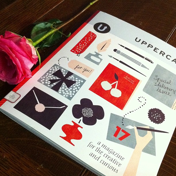
Our current issue features an extensive Stationery Guide with 50 profiled stationers and paper goods companies. Australian company Ask Alice is included and proprietor Sass Cocker emailed this fun image in thanks:

"Congratulations on another freakin' A-M-A-Z-I-N-G issue of UPPERCASE. I can't thank you enough for featuring Ask Alice... not once, but twice! It's a real honour for me. My cute Mum was teary eyed when I showed her and has since purchased several copies!"

Looks like her dog Diesel was a little too enthusiastic with the paper flag! (But we love to devour paper products, too. Like this lovely blank notebook with multiple found and upcycled paper stocks.)​

Thanks, Sass!​

Free stationery samples for subscribers!

Lagom Design

​This is the opening statement for the paper-lover's extravaganza of a feature in the forthcoming issue of UPPERCASE magazine. Profiling 50 companies who create greeting cards, wrapping paper, stationery and all variety of paper goods, the UPPERCASE Stationery Guide is an excellent reference if you're a paperholic, have a retail shop and are looking for unique items or are an aspiring stationery designer looking to break into the industry.

The companies we've profiled are all part of the UPPERCASE family; the feature was created from an open call sent out on the website and via social media channels. Once again, the talent of our readers is amazing!

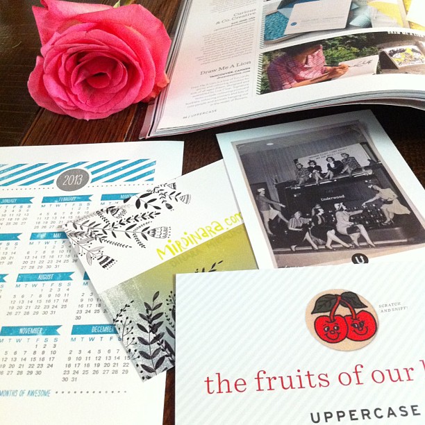
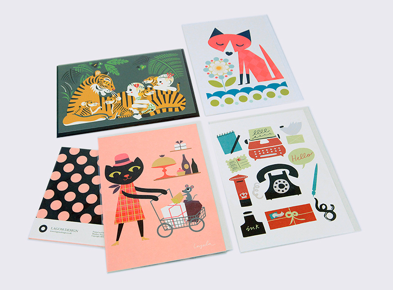
As a bonus to our subscribers, each subscriber copy will include an actual sample from one of the profiled companies. Greeting cards, bookmarks, letterpressed goodies... Erin and I were delighted as we opened each box that arrived at our door. I've photographed the samples to show you want you can expect to be hand-inserted into your subscriber copy. The following represent just a teaser of all the samples.​

​A. Favorite Design

​Mac and Ninny Paper Co

​Tweedle Press

​Curious & Co. Creative

​Steel Petal Pres

Just a small sampling of the amazing selection of what will be randomly included in your subscriber copy. Issue 17 is in print production and we're excited to ship this one out.

These free samples are only included for subscribers as of March 26—so subscribe or renew today to get this nice little bonus.

(Use the code "marchingrightalong" for a surprise discount at checkout. Click here to order!)

Thank you to Sandra, my SAIT intern for a week, who Photoshopped these images for me.

let's get Belinda from Australia to Sweden!

Le's all help Belinda Kemp (she's in Australia) get to Camilla Engman's Art Camp (she's in Sweden) this May. Belinda, whom many of you might know online as Gretchenmist, is a talented artist and surface designer. She has made it through a rough year and is looking forward to a creative retreat. She has launched a crowd funding campaign to assist in the costs of this journey. Belinda writes:

"Some of you may know that 2012 was a particularly difficult year for me {in a nutshell: long treatment for breast cancer and separation from my husband, who left half way through the year of treatment} and I'm pretty keen to put all of that behind me and make some life changes and new beginnings. So I'm off to Goteborg, Sweden to attend the Camilla Engman Art Camp in May 2013. This Art Camp has given me a positive goal to work towards and focus on throughout my treatment and the time has now come for me to undertake the journey."

Read more and make a pledge over here. The images above are available from Belinda's Etsy​ shop.

Wish you could go on your own visit to Camilla's part of the world? The Suitcase Series: Camilla Engman is monograph about Camilla's artwork, creative inspiration and lifestyle that we published a few years ago. Belinda features it throughout her video. Available in our shop!

love actually

We got this delightful surprise in our inboxes today from our friend Shelley Davies. You'll recognize her name because we've shared her work with you before. If you, like Shelley, work with collage, you'll want to take a look at our participate page to see how you can be a part of our Summer issue.  

If you look for it, I’ve got a sneaky feeling you’ll find that love actually is all around.
— Love Actually, 2003

Mark Cesarik fabric designs

Mark Cesarik is a designer and artist in New York who collaborates regularly with Freespirit Fabrics on fabric collections. "I'm very happy to be partnered up with Freespirit — it's a great outlet for people who love sewing and quilting but also have a higher fine arts sensibility. My background is fine art, illustration and design and I'm not a quilter or sewer, but fortunately my wife Cara is really locked in to whole craft/DIY thing." 

In the images above, Mark shares a preview from a forthcoming collection inspired by the colours and activities of Summer Camp. "My design process starts off in a sketchbook and then is brought into illustrator for vector and repeat creation. It's a really enjoyable process."

See more of Mark's digital artwork on Not a Gallery and his portfolio site.

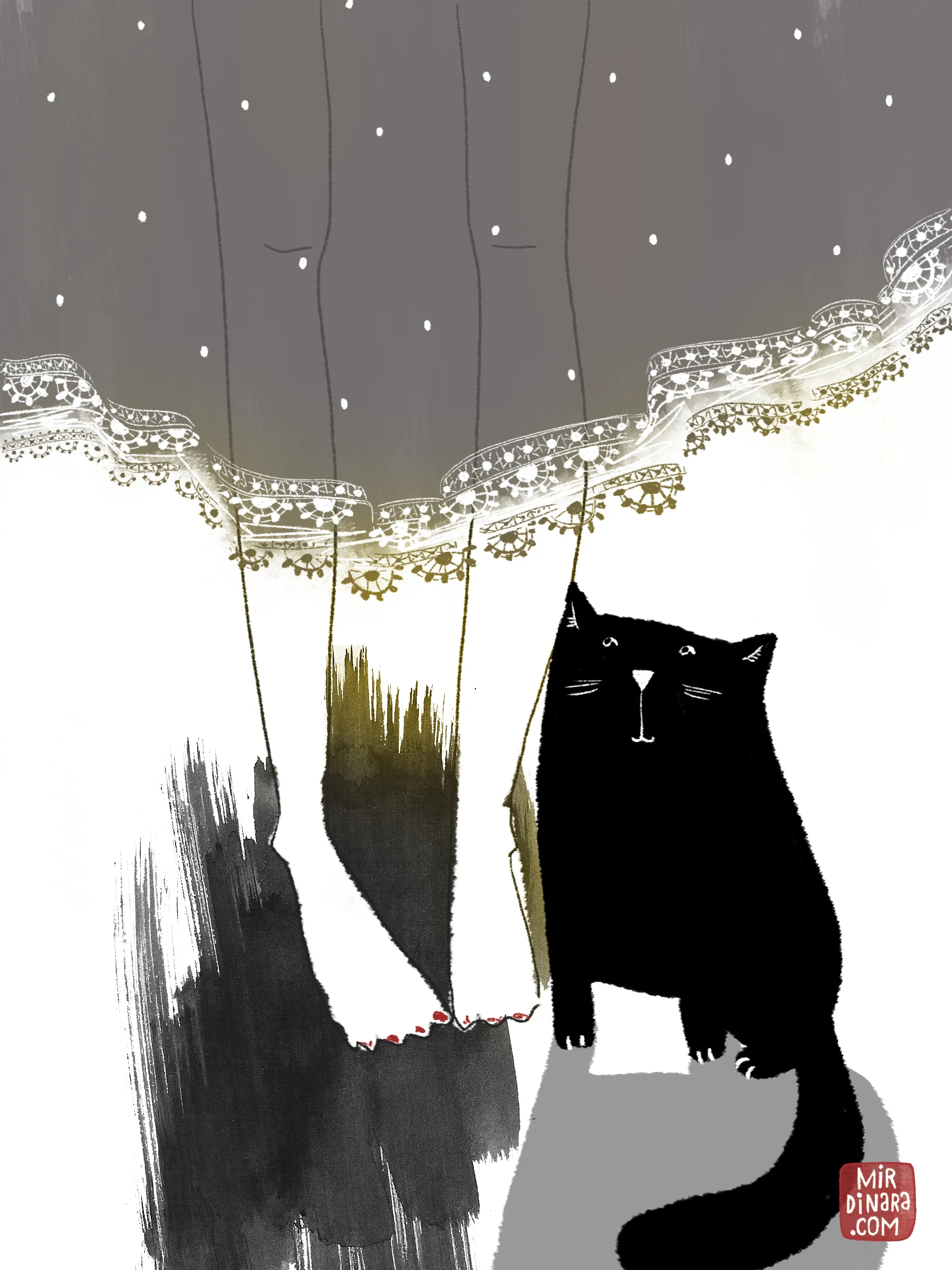
Dinara Mirtalipova

A beautiful tea towel by Dinara Mirtalipova.

I had the best of intentions to photograph all the amazing Christmas mail that I received these past few weeks, but alas—migrating to a new database took over ALL my time. I was even working on it on New Year's Eve. At last, the big mailing list for issue #16 is at the printer and all new systems seem to be working well. Perhaps I will just put all the mail in one terrific pile and post a picture of that!

For now, here is the gorgeous tea towel (available on Etsy) that I received from Dinara Mirtalipova. Dinara has spoiled me over the years, sending me beautiful objects and promo pieces. I love the direction her recent work has taken. Enjoy:

happy thanksgiving, american friends!

This chalk art by Melanie Burk is available as a free download compliments of Caravan. 

For us Canadians, American Thanksgiving also marks the start of the holiday season. With one month until Christmas, that year-end frenzied feeling begins! (Especially for people like me who have to design a magazine and get it to print in time for the New Year!)

If you're doing some last-minute Thanksgiving hosting or planning a holiday celebration, Caravan is a new online shop that offers downloadable printables and decorations. The shop is co-founded by UPPERCASE readers Alma and Mike Loveland (whom I had the pleasure of meeting at last year's Alt Summit) and Melanie Burk (Fifth & Hazel).

As you're sitting down to your turkey today, please know that the small UPPERCASE team—me, Eleanor, Erin and Glen—are very grateful for your support of UPPERCASE magazine. Our American friends account for more than half of our readers, so THANK YOU!

(And here's a little code... use "specialthanks" for $10 off orders over $50 in the shop until midnight tonight. Sorry, discounts cannot be retroactively applied or combined.)

ArtJunky

Artwork by Lorrie Whittington (Illusio Creative) from the ArtJunky flickr pool.

Lorrie Whittington emailed me recently to introduce one of her projects, Artjunky.net. The site is "a contributor-based online art and design magazine, supporting artists, illustrators, designers, photographers and makers. Created by Lorrie Whittington and Stina Jones, and supported by a growing team of contributors, ArtJunky seeks to give creatives of all ages, disciplines, backgrounds, both emerging and established, a platform to showcase their work, profile new projects, design initiatives, techniques and tools of the trade."

I asked Lorrie a few questions about the new site...


With your own active blog and art practice, why did you and Stina decide to launch ArtJunky?

Why did we launch? Well, both Stina and I felt we wanted a  platform for ourselves and other artists to talk about that which we are passionate about, and that is art and design.

Both Stina and I enjoy writing about art other artists, new projects, initiatives, events and that which inspires us, but we didn’t want to use our own blogs for this. Our personal blogs are exactly that, personal and intended as vehicles to talk about our own art and personal lives, and whilst we both occasionally like to feature other artists on our blogs, events we have attended, and exhibitions etc, there is a risk of our own blogs becoming an entirely public space.

We also wanted something that was contributor led, which would not be tenable on our own blogs.

Today, well known Swedish illustrator, Patrik Boberg of Piktograkifa has now come on board which is great, as we are looking for illustrators, designers with an international flavour to come on board, and talk about what is going on in their own neck of the woods so to speak, and their own unique perspective.


What audience are you hoping to attract? What void do you aim to fill?

Whilst there are many good online magazines profiling artists, illustrators and designers etc, the majority of the artists featured are already well established, and those lesser known are just not finding a voice. So, we want to profile lesser known artists as well as those already established. Plus which, both Stina and I have noticed a significant ‘ageism’ at work in the art and design world. There are many good artists and designers around who are over the magic ‘35’ who are largely ignored. We want to give them a platform too.

So, our target audience are professionals AND enthusiastic  amateur artists, designers, photographers and creatives of all disciplines and mediums, and age groups.


How do you select your contributors?

Well thus far, Stina and I our reviewing our own network of artists and designers. Personally, I have been looking for  people whose work I admire, who have a track record of blogging and writing, who are enthusiastic about art and artists etc, and whom I like.

To find out more about contributing, click on over here.

meeting Mirthe Blussé

My first destination once arriving in Schipol airport was  to visit illustrator Mirthe Blussé, who had cordially invited me to visit her studio.​ Her studio is on the the 6th floor of the Volkskrantgebouw building, formerly the headquarters of the newspaper Volkskrant. Now housing dozens of tenants of creative industry plus a nightclub restaurant on the top level, the Volkskrantgebouw was kind of gritty in a cool art college-meets-industry sort of way.

Mirthe's studio, shared with illustrator Puk, ​was light-filled and punctuated with colourful bits of paper and collage. Mirthe's work has a wonderful unconstrained freeness about it, with playful yet elegant sprawling handwriting, simple graphic collages and more conceptual ones. Mirthe started out with a degree in copyright law, but her lifelong passion for creating art was too strong to ignore.

Please visit Mirthe's portfolio and blog to see more of her work (we can also look forward to a magazine feature on Mirthe in an issue of UPPERCASE next year.)

​Thank you, Mirthe, for such a nice way to start my adventure in the Netherlands! 

subscriber profile: Kim Welling

​KIM WELLING

How are you creative in your daily life? I feel so lucky to say I can be creative all day long, which comes with being a freelance illustrator and -teacher. I draw, paint, cut, glue and put it all together on my computer. What inspires me most is little things like kitchen equipment, my veggie garden and personal feelings. When I'm not being creative for work I like to put my 'make-energie' in baking pies and cookies, sewing and all sorts of creative projects interesting enough to pursue. From a cabinet-turned-rabbit-cage to growing heirloom vegetables and decorating my living room.

What are you most curious about? At the moment: Portland, Oregon. It seems like there's so much creativity going on there at the moment. America intrigues me (I don't know why, it's a gut feeling) and recently the west coast and Portland in particular. I'd love to feed my curiosity and go there some day soon...

What is your most prized possession? My pet rabbit Seb. He's cuddly,  a bit grumpy and a main inspiration. My computer comes in an important second place, would be hard to live without it.

What is your favourite letter of the alphabet and why? Underscore a, I like how (in most fonts) it's a curled fella with a little 'roof'. When you see an 'a' in handwriting most people don't write it with that little 'roof' over it, but I do, on purpose cause I like how my pen swirls when I do.

What is your favourite colour? All kinds of green. I'm amazed by how many mesmerizing greens there are in nature.

What is your preferred creative tool? A soft grey pencil.

www.kimwelling.com
kimwelling.blogspot.com
www.kimslittlemonsters.etsy.com

Would you like to be profiled on the blog or in the magazine? Submit your profile!

typewriter notecards call for submissions

Would you like to collaborate with UPPERCASE and be published by Chronicle Books? Doesn't that sound amazing?

TYPEWRITER NOTECARDS is a boxed set of 20 notecards and envelopes featuring Polaroid or lo-fi/retro-inspired photographs of vintage typewriters, taken by UPPERCASE readers. It will combine our love of outdated technologies into beautiful notecards suitable for a variety of occasions. Chronicle Books plans to publish it for the Spring 2014 season as a follow-up to Shoegazing Notecards, curated and designed by UPPERCASE editor Janine Vangool.

We look forward to your submissions! Please keep in mind that the images will be used for notecards, so we will be looking for images appropriate for a variety of occasions such as birthdays, anniversaries and weddings, Valentine's Day, Mother's Day, friendship, thanks, general greetings, etc. The typewriter should be a prominent, but not necessarily an exclusive element in the photograph. Typewritten text, keys, hands, fingers and other props are all ok. If a person is represented we prefer no faces (for example, a person typing as seen from behind, or perhaps wearing a hat or with their face somewhat obscured thus making the card more universally appealing rather than a portrait of a specific person.)​

CLICK HERE FOR THE SUBMISSION DETAILS. >>>

hearts

​Now that issue 15 is starting to arrive in mailboxes, it is fun to see your reactions. (If you haven't received your copy yet, keep in mind that the world is a big, big place and the mail is often a test of patience! Canadians seem to be receiving theirs now, Americans to follow. For Europe and Australia, please know that it will likely take a few weeks.) 

Belinda Fireman tweeted this photos and message:

"I think @uppercasemag and my painting like each other."

I quite agree! On a grey, snowy day it is nice to see some more pops of exuberant colour. Belinda is a Calgary-based artist with a surprising Etsy shop. She poses with her art! I thought this was an unusual and charming way to showcase her work—her personality definitely shines through. I spend quite a bit of time on Etsy and though you often see people who make clothes and accessories posing with their work, I don't think I've ever seen someone presenting their paintings and drawings in this way!

paper hats by Alyn Carlson

October is the month when you can have fun with trying on new different characters and personalities, falling under the excuse of Hallowe'en. For inspiration, look to paper artist Alyn Carlson's extraordinary hats.​ Suitable for a garden party, whimsical wedding, a paper-lover's birthday party or just-because, Alyn's creations bring happiness to the wearer and the party.

Alyn's work space and home is an old church that she has lovingly restored and renovated for many years. Click the photo to read about Alyn's home on Design*Sponge.

Alyn was recently commissioned to make a wedding cake out of paper and she is also a graphic designer and fine artist.