

type tuesday: Thrift Score on Etsy
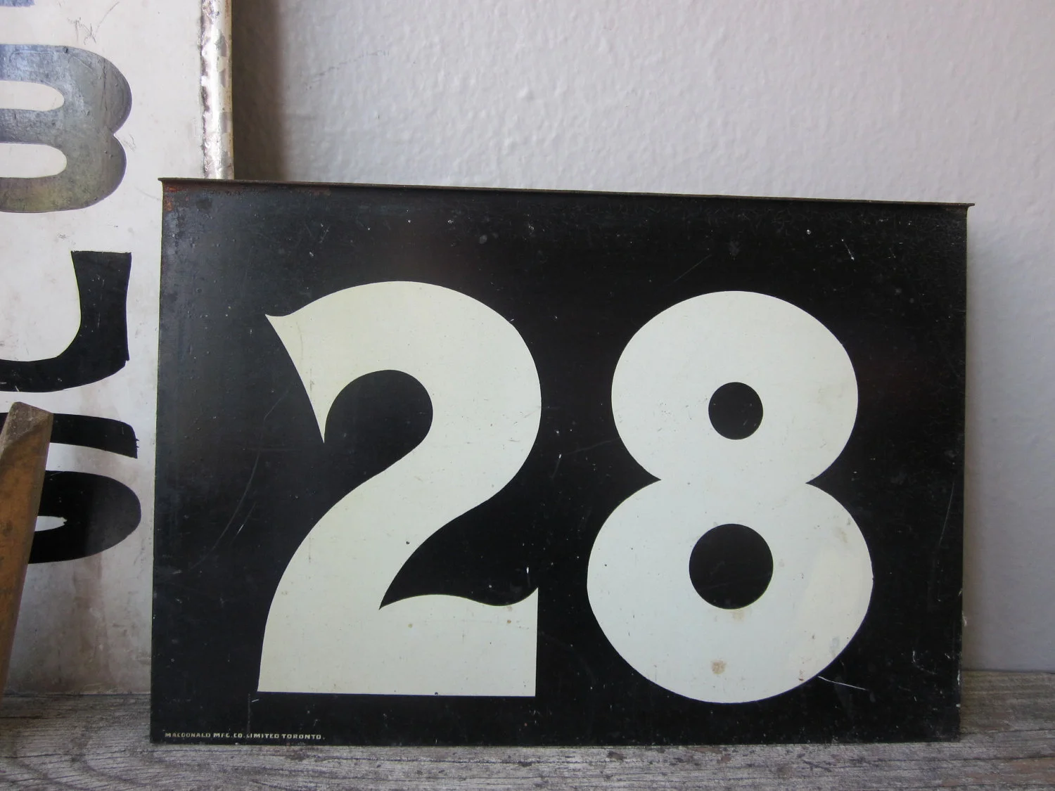
/Some clever merchandising in Thrift Score makes some plastic letters oh-so-appealing (vintage fabric not included, alas.)
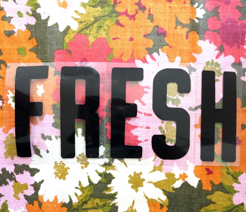
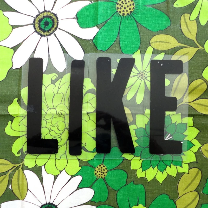
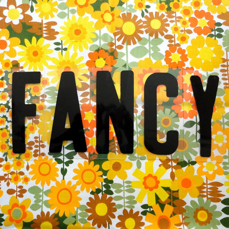
Some clever merchandising in Thrift Score makes some plastic letters oh-so-appealing (vintage fabric not included, alas.)
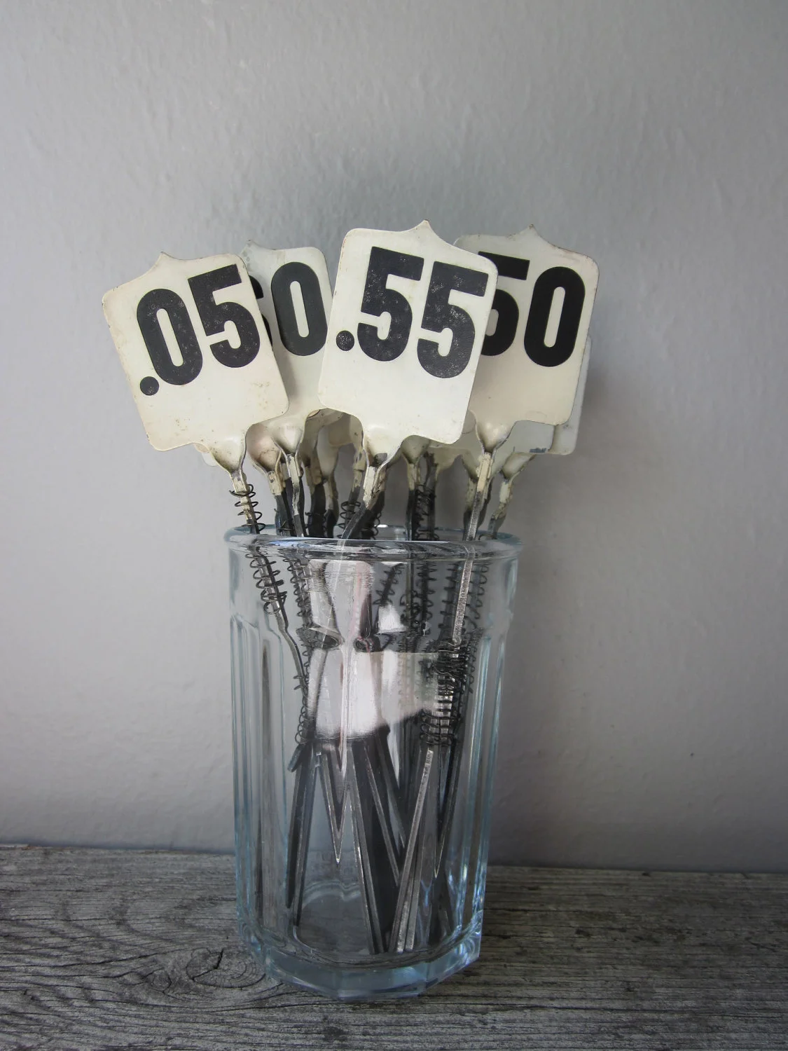
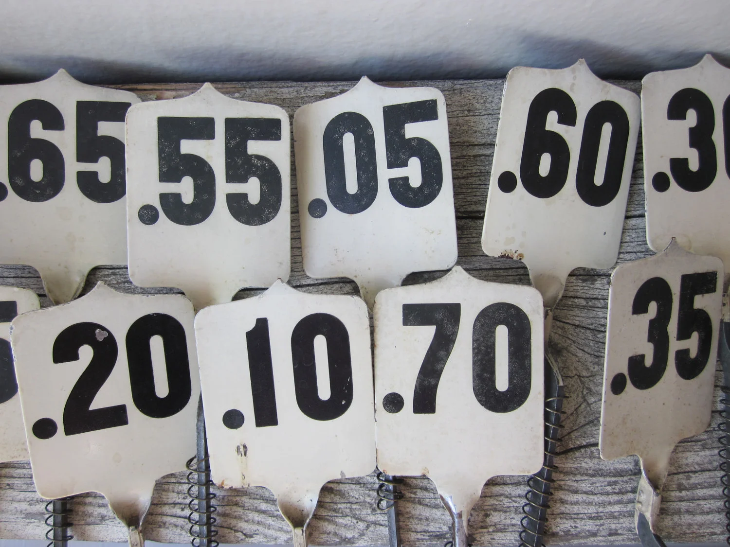
(At home, I have a few cash register flags planted next to some houseplants that need support.)
This looks like a good prop for artist Christopher Stott!
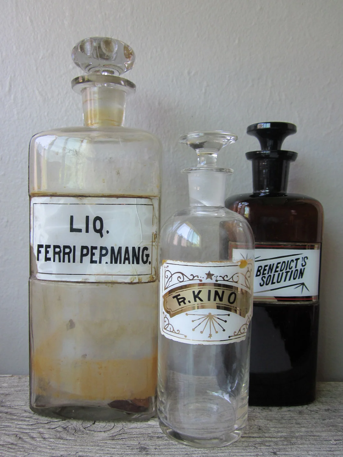
San Francisco-based Etsy shop Housewarming has a wonderfully curious supply of old apothecary bottles, sign pieces and other covetable objects for type-lovers.

I was in Berkeley today, so I paid a visit to Berkeley Typewriter. I will share extensive images soon (when he saw the typewriter on my business card and found out I was visiting from Canada, the repairman let me take pictures in the back room!), but for now here is a tantalizing instagram.

In issue #12 we introduced you to Jennifer Collier in the article My Life With Paper. We shared the image of her typewritter (left) but our intrepid reader Shelley Davies found some detailed shots that are worthy of examination.


“My practice focuses on creating work from paper; by bonding, waxing, trapping and stitching I produce unusual paper ‘fabrics’, which are used to explore the re-making of household objects.”


JAN MIDDENDORP VISITS THE UPPERCASE STUDIO, JULY 30, 2012
If you don't already receive the occasional transmissions from My Fonts entitled "Creative Characters", you should definitely sign up. With in-depth profiles and lots of visuals, these mailings go beyond your typical e-newsletter. "Creative Characters" is written by Jan Middendorp, a designer and writer currently based in Berlin. Jan was travelling through Calgary to visit some family before heading off to TypeCon this week—I was honoured that he stopped by UPPERCASE.
Jan is the author of an amazing typographic tome, Dutch Type, released in 2004. The 300+ page book is an excellent guide to the many prolific Dutch typographers both historical and contemporary. I'm lucky enough to have a copy that I ordered from the Netherlands back when it was first released; the book is quite rare now and Jan himself has just a couple copies left.
Jan shared a preview of his newest work, Shaping Text. Published in two editions (Dutch and English) this book is an overview of typography with a very current and appropriate slant: whether in print or on the web examples of good design are shown with equal importance rather than relegating web- or multimedia-based design projects to an afterthought chapter.
Thanks, for stopping by, Jan. Have fun at TypeCon!
When I spotted this box of typewriter tins at a flea market in Seattle whilst visiting Tif (aka dottie angel), I had to play it cool in order to get a fair price from the seller. Look what was inside!
It was about five or six years ago that this particular ribbon tin design ignited my typewriter ephemera obsession. Before coming across it on eBay (and of course bidding to win it), I wasn't aware of the amazing artifacts of promotion and packaging associated with typewriters. It was my lucky day to score an nearly complete box of my favourite tin!
One of these Type Bar typewriter ribbon tins could be yours as part of "The Royal" level of support for The Typewriter project.
I love this simple packaging for typewriter paper. It's beautiful and gets to the point. The drop shadow and slightly awkward letterspacing is just icing on this sea foam cake.

John Hancock couldn't have imagined the impact his signature on the Declaration of Independence would have. I'm sure he knew that this politically important document would put King George III on notice and possibly change the course of the world. His mark has transcended the role of a mere politician to become an idiom. Legend goes that he wanted to make his signature large enough that George could see it without his glasses. But I like to picture John up late flourishing away by candlelight and secretly strategizing how he'd beat Thomas Jefferson to the quill.
In Issue #14 we asked our readers to illustrate, illuminate, design or render their first name in a way that expressed who they are.

Alice (Yun) Chiang

Michelle Last
David Daley is a new neighbour in Art Central. He received a month-long St[art] residency courtesy of the Calgary Allied Arts Foundation and is painting in a studio in the lower level. I was immediately interested in knowing more about David's work since it combines signpainting, design ephemera and arresting colour combinations. Given the confident execution of his work, I was surprised to learn that David has only been painting for a year. His fine lines and meticulous work at first look to be silkscreened when in fact they are painted by hand with fine brushes.
“My career as a mixed collections conservator has seen me working in art galleries and museums to preserve and interpret artworks and objects of cultural property. Over the years, I have acquired a very good understanding of artistic styles and design aesthetics. No longer content to simply preserve the works of other artists and originators, I’m now finding ways to express the artistic ideas I have been collecting for a long time.
I have a fascination for nostalgia and love vintage aesthetics and styles. To me, learning about other eras and exploring the sense of ripeness that different times possess is fascinating. Examining the timelessness and subjectivity of modernity compels me: every age is modern for those who live in it. But what things are constant about popular culture and sub-culture and what things are ever-evolving? What remains ageless and what is a fleeting trend?”
“I have started making paintings from images taken from black market 20th century erotic material. Tijuana Bibles were illicit underground comic books which put comic characters, celebrities and even politicians of the day in sexually explicit situations. The little booklets were mass produced from the 1930s to the 1950s and I have used the cover designs to make paintings in vintage or pop-art colour schemes.
I like to produce art that has a raw visual appeal: art that I think looks good. To me, the flirtatious messaging in the Tijuana Bible covers carried over well to the paintings by expressing a playful and fun look at life and sex. Fashions come and go but some of the pleasures in life transcend the prevailing modes.”
If you'd like to get in touch with David, please contact him by email.
For those of you not familiar with the Calgary Stampede, it is an annual exhibition and rodeo with midway rides, nightly fireworks and associated free pancake breakfasts scattered throughout the city (apparently there's an app for finding the breakfast nearest you). For ten days each summer, the city transforms into a strange cowboy and western set: hay bales are public seating, barnwood is tacked up on restaurant doorways, downtown office windows are painted with "yeehaws" and "howdy, partners". Not to mention the fashion: all shades of denim, bandanas, cowboy hats and boots (the more tassels, pattern and snaps the better)—it really aims to be the greatest outdoor show on earth. This year, the Stampede is marking its 100th year. I've lived in Calgary for 20 of them now, so I consider myself a proud Calgarian.
But Stampede is not quite my cup of tea... The Stampede is loud; I'm quiet. Beer tents and drinking is advertised as a featured activity; I don't drink. The midway offers bigger thrill rides; I have a weak stomach. Other than the fireworks and the photographic appeal of the midway at dusk, there's not a lot about Stampede that I can relate to.
I wonder what the early years of Stampede were like... I'd love to attend Stampede 1912 rather than 2012. Thanks to an exhibition in Art Central, I was able to a step back in time with the poster graphics of years gone by.
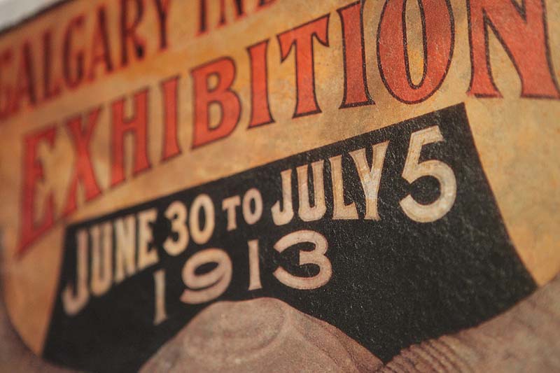
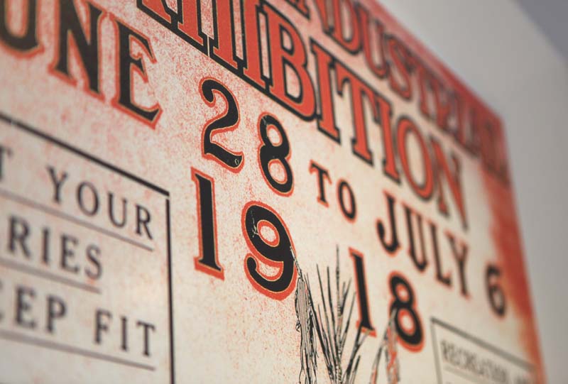
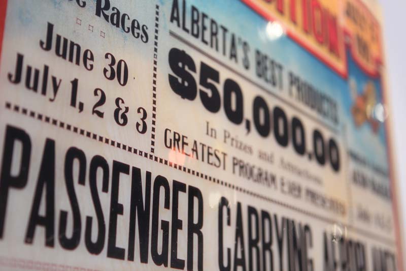
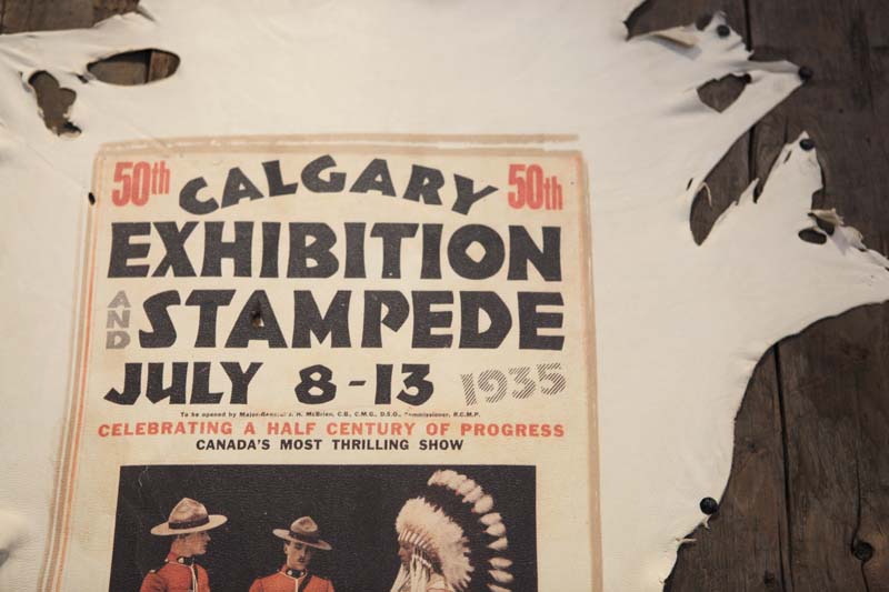
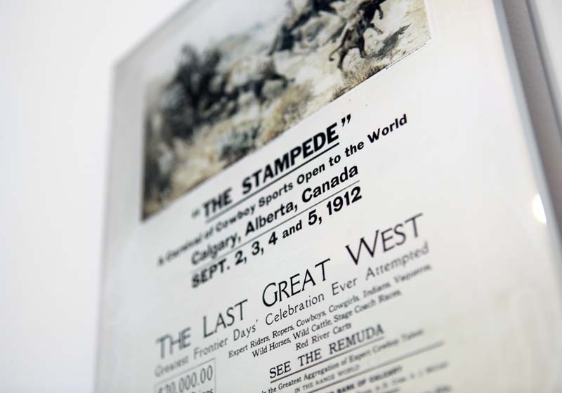
The exhibition is presented by AXIS Contemporary Art and Quintaro Graphic Reproduction and features digital poster reproductions on various substrates such as metal and rawhide. In addition to the typographic interest of the earliest posters, from a design standpoint it is interesting to see how versatile digital printing technology is. The show gave me lots of ideas of how I could reproduce graphic art and posters.
The posters will be on display until July 20th on the main level of Art Central, Calgary. (UPPERCASE's studio is on the upper level of Art Central.)
A documentary by student filmmaker Hanah Ryu Chung about the present and future of books. Shot in Toronto, it features lots of independent booksellers (including UPPERCASE stockist Type Books) as well as bookbinders and letterpress printers. Nicely done. {via The Travelling Bookbinder}
Hooray! The Sign Painter project on Kickstarter has reached its goal and still has a few days left. I couldn't resist the $200 pledge level:
Your name, logo or design hand painted AND CUSTOM-DESIGNED BY CHES PERRY on an 18"x24" show-card plus a professional photo and video taken of your sign being lettered for however you wish to use it: website, print or to show your friends how awesome it is that you had your logo or design hand painted by a old time sign artist. Also includes the sign painting instructional DVD to learn how to sign paint, techniques and tricks (fall delivery date on DVD).


The Heads of State are masters of saying a lot with very little—and without sacrificing style or visual interest. They're special presenter's at this summer's TypeCon in Milwaukee:
"For ten years, Jason Kernevich and Dustin Summers have been working together as The Heads of State for clients as diverse as The New York Times, Starbucks, the School of Visual Arts, Penguin, and bands like R.E.M., Wilco, and The National. Throughout those years they’ve had an up and down relationship with typography. This talk will feature various typographic tales in which our heroes fall in love with letters, rebel against fonts, forsake letterforms to become illustrators, and then beg for forgiveness."
Are you going to TypeCon this year? We're looking for a few correspondents to report back for the blog. Leave us a comment with your website or send us an email for more details.
Synthese, a new release from the Parisian foundry Bureau des affaires typographiques.
The international design company Pentagram recently turned 40. To mark this anniversary, the nineteen current partners designed posters for each of those years. The only rule for the design was the use of black, white and red. To view all 40 posters, visit the company's blog.


Cover by Christy Batta

The UPPERCASE Circle is free for subscribers of the print magazine. Find out more.
UPPERCASE is a quarterly print magazine inspired by craft, design and illustration. A playful exploration of creativity, an affinity for vintage ephemera, and a love of handmade are some elements common in each issue. The magazine boasts high-quality paper and printing, a unique design aesthetic and incredible attention to detail.
Janine Vangool
publisher / editor / designer
Send a message →
* Before emailing submissions follow the guidelines here.
Glen Dresser
customer support
Please contact Glen for help with your purchases, wholesale inquiries and questions about your subscription. Include your full name and mailing address so that we can better assist you.
Send a message →
UPPERCASE publishing inc
Suite 201 b
908 17th Avenue SW
Calgary, Alberta T2T 0A3
403-283-5318
The studio is not open to the public—please get in touch to make an appointment. If you'd like to purchase our magazine and books locally, please see the stockist page.


