Back issues are just $10 through Monday.

Look at all the work I've done over the years! How time flies when you keep yourself passionately busy. 

All of my babies are available to enjoy while inventory lasts (issue 10 and 11 are running low at this point). On sale for just $10 apiece until end of day Monday, I'd suggest getting one of each. Subscribe starting with #23, the current issue, and you'll be all set for an inspired year ahead.

p.s. Use the code "thankyou" for another $15 off orders over $80.

featured stockist: sérendipité

Celine Debray founded the Swiss-based company Sérendipité in early 2013, with a vision for a traveling bookstore that offers foreign magazines at creative events, such as antique fairs and design events.  

In less than a year, Sérendipité's clientele has grown beyond events to include boutiques as well as individual customers who subscribe to their imported offerings. 

This past fall, Celine moved the business from her home office into a large coworking space called Carbu that is shared with architects, photographers and other creative companies. (The current issue of UPPERCASE has a lot of inspiring content about the emerging trend of coworking.)

For customers in Europe, Sérendipité's sophisticated online shop is a reliable source of UPPERCASE and many other creative magazines. 

roving reporter

We're happy to have a roving reporter on the ground in Toronto this week. Christopher Rouleau will be attending the 14th edition of DesignThinkers—Canada's largest conference for visual communicators. 

Christopher is a freelance graphic designer and letterer in Toronto whose clients include: Toronto Star, Pride Toronto, and University of Toronto. When he's not working on personal side projects (like the Toronto Etiquette Project) or making alphabet prints for his online shop, Christopher is out looking for antique lettering samples or hanging out with his two cats, Milo and Cheddar. He's got a thing for hand-lettering and simple, geometric typefaces of the 1940s-1950s, as well as old-fashioned lettering guides, eye charts, maps, packaging, and ephemera. 

Christopher will bring his amazing talent and skill to his coverage for us. The sketch he hand-lettered in graphite (above) reflects the style he will use to share his DesignThinkers experiences. Stay tuned!

Follow him on Twitter and Instagram for news from Toronto.

You may recognize Christopher's name from his office letters submission in issue #19.

featured stockist: Kinokinuya NYC

A thrilling moment, to see UPPERCASE so prominently featured in Kinokinuya's New York store.

 Kinokinuya. For those of you who have been to one of their US locations, the name is enough to conjure visions of book heaven and washi-tape wishes. I go to their San Francisco store anytime I'm in that city and I've been to the Seattle location, too... but NYC is now top on my list... why? Because I got to see UPPERCASE magazine amongst all the amazing books that I admire and covet. A dream come true.

And here is The Suitcase Series: Camilla Engman translated into Japanese and published by Graphic-sha! It was nestled with all my favourite Japanese lifestyle books and looked right at home. The Suitcase Series was inspired by these sorts of Japanese books (that I can't read, mind you!) and so it has come full circle to see this book and Dottie Angel translated for a Japanese audience.

curated Etsy

While you're waiting for issue #19 to arrive, we have a special treat to help get you in the mood. Etsy Canada invited Janine to curate a list based some of the themes from issue #19. 

curious crystals

office letters

fall for orange

#19 on press!

Curt pulls a cover sheet for review.

Press controls. 

Curt looks over the details. 

Monitoring the ink density.

The Heidelberg in action. 

The inside back cover. (Prolific also printed Work/Life 3.)

The cover (art by Lydia Shirreff) with subscription and promotional postcards.

Issue #19 is on press today! Thanks to Chris Young of Prolific for the shots of the cover in progress. 

Subscribe or Renew today!  This is the last week that you can start a subscription with #18. Then #19 will follow quickly in early October. UPPERCASE magazine is supported through its readership, so your subscriptions are vital in keeping the printing presses running!

peek at #19

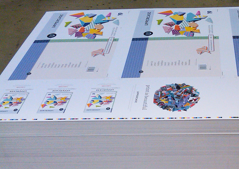
The fall issue of UPPERCASE magazine is one to look forward to! As I put the finishing touches on the print files, I thought I'd share a tiny sampling of the wonderful images included in the forthcoming issue. (Did you know that each issue has on average 400 placed images?!)

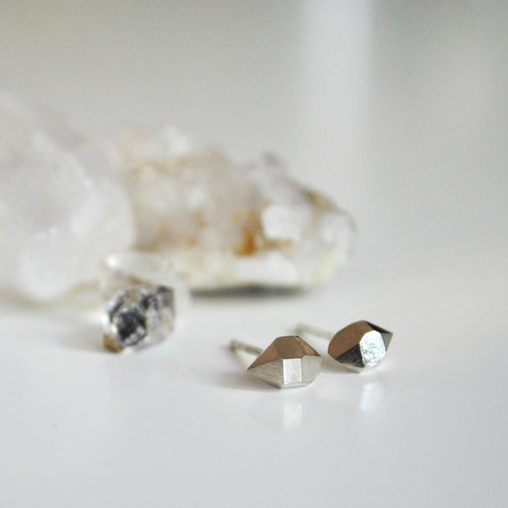
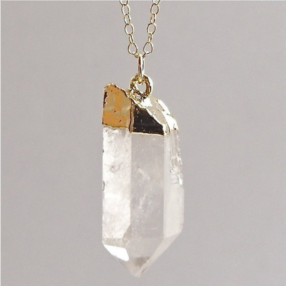
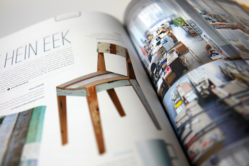
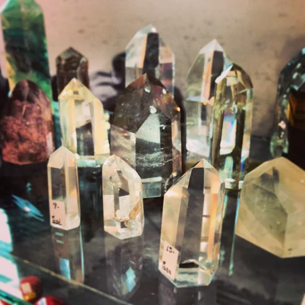
While compiling and commissioning the content for fall, I was guided by two major themes: the aesthetics of work (office supplies, vintage offices, co-working, workspaces) and the sparkling beauty and pleasing geometry of rocks, gems, minerals and crystals.

As editor and designer, it is always exciting to see how themes that I began working with months ago finally come together in cohesive yet surprising ways. From the rugged beauty of Iceland as experienced by illustrator Lisa Congdon to the work fashion of Japanese aprons to sleek co-working studios in New York and London—this issue's geographic reach is vast. From startling realistic paintings of gems to the abstracted geometry of crystals—this issue's graphic styles are diverse. From collaborating with strangers to working in a generic cubicle to working with one's spouse—the perspectives on work are varied. This eclectic selection of content is what makes UPPERCASE magazine so unique!

Subscribe or renew today! 

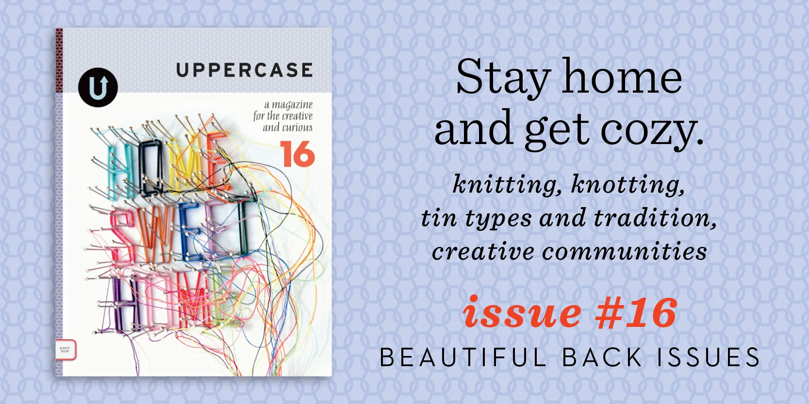
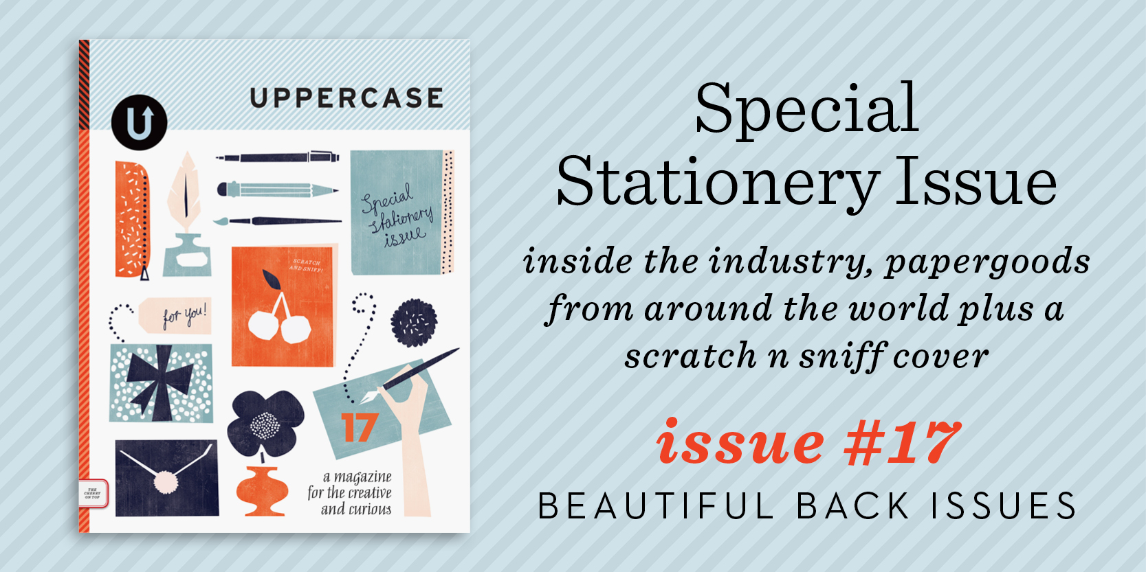
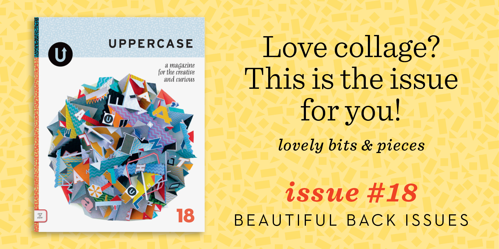
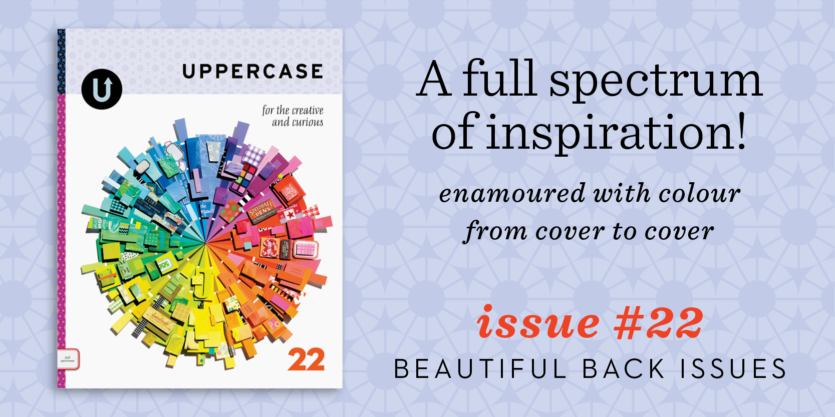
(Missing some back issues? You can purchase those in the shop as well.)


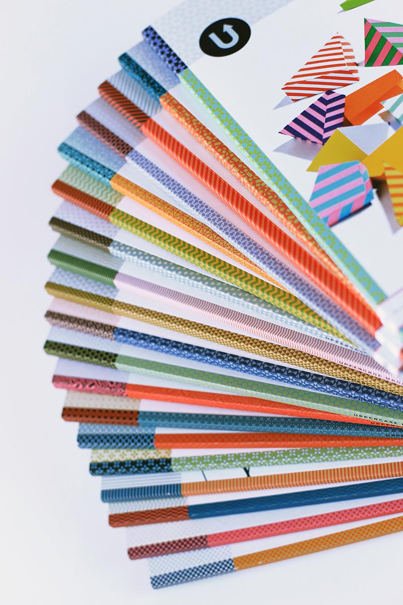
Paper illustration by Lydia Kasumi Shirreff: she created the artwork for our fall cover and I can't wait to share it

Amethyst painting by Carly Waito: yes, that's a painting!

Office letter submitted by Amy Freeborn: who says glitter isn't a standard office supply?


submit your office-inspired typeface!

Submission by Christopher Rouleau. "This is a modular alphabet created with an office supply that I have in abundance: staples. My goal was to create tiny metal letterforms using the least amount of bends. The result is a full Latin alphabet, with a mix of miniscule and majuscule characters."

Office Letters

Office supplies can be gloriously inspiring! For our fall issue, we're looking for submissions of letterforms (or entire alphabets!) inspired by office supplies. Whether it's a study of the possibilities of a single item, such as the bulldog clip and paper clip explorations above, or the exploitation of many same or various supplies like the rubber band examples above, we want you to raid the supply cupboard and show us your ABCs.

Create a letter or an entire alphabet. Submissions should be at least 6 inches wide at 300dpi, on white backgrounds. 

EXTENDED DEADLINE: Please submit here until August 16.


promote yourself in print

Get your product or service in front of our engaged and creative audience. Our Fall issue (released in October) is the perfect way to reach out to customers before the holidays. Each issue of UPPERCASE is 116 pages of inspiring content. And with just a few pages of ads allotted per issue, your message will standout. 

Visit our advertising page to find our more and submit your ad. 

type tuesday: call for submissions, issue #19

Erik Berger's Bandpile

Erik Berger's Bandpile, made from rubber bands.

Teo Menna paperclips alphabet

Dave Wood's bulldog clip alphabet. 

Office supplies can be gloriously inspiring! For our fall issue, we're looking for submissions of letterforms (or entire alphabets!) inspired by office supplies. Whether it's a study of the possibilities of a single item, such as the bulldog clip and paper clip explorations above, or the exploitation of many same or various supplies like the rubber band examples above, we want you to raid the supply cupboard and show us your ABCs. More details on how to submit over here on our participate page. Deadline: August 10.

issue 18

How time flies! Eighteen issues stack up.

I am happy to share these closeups of our latest issue. I love the physicality of the magazine—getting to hold a printed issue in my hands is always the ultimate reward. To know that another issue is done and that the writers, contributors and I have done our best to design and produce a publication that looks great and is FULL of amazing content... it is very satisfying. I hope these previews will entice you to subscribe: getting UPPERCASE delivered to your home is a special thing.

This issue has a lot about collage. This image by Vivienne Strauss.

This collage by Laura Redburn.

I love Sarah Bridgland's dimensional collages and am in awe of her wonderful work. So happy that she is this issue's cover artist!

A profile on French designer and illustrator Mathilde Aubier.

Greg Lamarche made this creative and curious typographic composition for us.

A spread showing work by Greg Lamarche.

Dynamic Duo of { Ma + Chr } 

Shelley Davies made this great collage for our contents page.

Feature on Dutch designer Piet Hein Eek, inspired by my trip to his studio last year.

Drawing and furniture by Thomas Wold.