type tuesday: Roué

In April, I attended the Alberta College of Art & Design's portfolio show for graduating designers, illustrators and photographers. One of the standout pieces was a collaboration between Justine Anweiler and  Kaewjinda Hataitham. They had produced a single large-format fashion magazine called Roué that was digitally printed—and then handlettered the final headlines and embellishments using lipstick on the printed version. It was really fun to see it in person; the lipstick oil was starting to seep through the paper and smudge, but it was truly original—and memorable months later.

type tuesday: she choked on her words

We would like to congratulate UPPERCASE subscriber Eva Schroeder for being part of the Australian Craft Awards. In this inaugural event, online viewers can vote for projects created by Australian craftspeople. Eva describes the process: "Judging will be based on a three-tier process," Eva writes. "The number of online votes from the public, votes from the industry and a panel of professional judges. I was encouraged to apply based on one of my pieces of work. The award, although just a piece of paper, would mean that I could be taken seriously!" 

"In making this piece, I wanted to experiment with paper, both as a 3D sculptural media and a form of bodily decoration, as well as a way to play with words and their double meanings. With this combination in mind, I developed the 'Choker' out of paper, using predominantly geometric shapes, the printed word, a little wire and a few sparkling beads." 

"Each of the chosen words featured on the baubles begins with the letter 'C' and references the definition of the negative way that humans can speak to/and are spoken to in life. These methods of communication can lead to the subconscious stifling of the spirit and therefore the 'choking effect'."

Eva would love your support: please vote here

type tuesday: Chuck Seerey

The Elliott Fouts Gallery emailed to share the work of Sacramento-based artist Chuck Seerey.

"I want my artwork to be visually intriguing and to contain enough ambiguity to cause a sense of mystery that evokes questions. I am fascinated with the making of paintings that explore movement, form and space within the picture plane. Patterns, textures, and forms are deconstructed and reconfigured to create new rhythmic patterns that repeat at regular and irregular intervals with a strong emphasis on texture and colour. I am interested in the process and craftsmanship of making artwork and like to emphasize surfaces that call to mind the past, that have accrued character through time, to instill in the painting a sense of realness."

To me, these oils on canvas suggest weathered roadside signage that has been cut and rearranged into mosaics. The letterforms are abstracted just enough to be admired strictly for their shapes rather than their meaning. 

Chuck's work is available through the gallery here

type tuesday: splattered letters by Lou Medel

Lou Medel was inspired by the splotchy and splattered lettering technique of Ralph Steadman. He created a typeface and time-lapse video that shows his process. Lou write, "In March of 2013, the original pieces, and video, where part of the TYPEFORCE 4 Show in Chicago. I recently produced a screen printed poster that features all 26 characters. You can purchase the finished poster on my Etsy Shop."

Would you like to be featured on the UPPERCASE blog? Follow the directions on this page to submit. 

submit your office-inspired typeface!

Submission by Christopher Rouleau. "This is a modular alphabet created with an office supply that I have in abundance: staples. My goal was to create tiny metal letterforms using the least amount of bends. The result is a full Latin alphabet, with a mix of miniscule and majuscule characters."

Office Letters

Office supplies can be gloriously inspiring! For our fall issue, we're looking for submissions of letterforms (or entire alphabets!) inspired by office supplies. Whether it's a study of the possibilities of a single item, such as the bulldog clip and paper clip explorations above, or the exploitation of many same or various supplies like the rubber band examples above, we want you to raid the supply cupboard and show us your ABCs.

Create a letter or an entire alphabet. Submissions should be at least 6 inches wide at 300dpi, on white backgrounds. 

EXTENDED DEADLINE: Please submit here until August 16.


type tuesday: Fairgoods

Ne10 is a typeface and physical stencil designed by Corey Holms

Fairgoods is a new online destination for shopping for products where the creator is at the forefront.

Shameless Deluxe, designed by Neil Summerour

Signature necklace by Brevity.

Shauna Luedtke, an art director at fairgoods.com wrote in to introduce their new start-up:

"Fairgoods is an online store that sells a curated selection of accessories, housewares, apparel, decor, and digital goods like type (and goods made using type in both overt and subtle ways). Some of our products are things we’ve created with makers, some are things we’ve made ourselves, and some of them are existing products we love. 

First, you ask Neil Summerour to hand-letter the words Strokes of Genius. Then you cut white vinyl stickers and take them to Blanchette Press. And then you put those stickers on notebooks and invite some friends and fellow makers over to do some painting. Credits: Neil Summerour, Aaron Blanchette, Adam Blanchette, Gail Blanchette, Marie Hohner, Xerxes Irani, Beau Lark, Dawn Mesana, Drew Ng, Xuan Nguyen, Victor John Penner, Darcy Twarog, Mark Vanderland, Wendy Wan, and Jonathan Wood.

Fairgoods is about putting the maker at the forefront, and documenting the process of how things are made. It’s about letting our customers into the process, into the work itself — and celebrating it."


type tuesday: call for submissions, issue #19

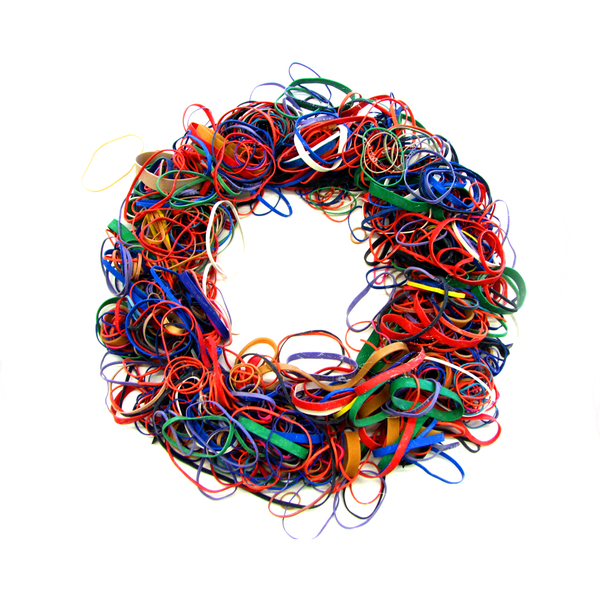
Erik Berger's Bandpile

Erik Berger's Bandpile, made from rubber bands.

Teo Menna paperclips alphabet

Dave Wood's bulldog clip alphabet. 

Office supplies can be gloriously inspiring! For our fall issue, we're looking for submissions of letterforms (or entire alphabets!) inspired by office supplies. Whether it's a study of the possibilities of a single item, such as the bulldog clip and paper clip explorations above, or the exploitation of many same or various supplies like the rubber band examples above, we want you to raid the supply cupboard and show us your ABCs. More details on how to submit over here on our participate page. Deadline: August 10.

type tuesday: Christopher Rouleau

Chris Rouleau (with help from Erin) shows his work at our Show and Tell event held last Thursday at Kid Icarus.

Our Show and Tell event at Kid Icarus last Thursday evening was lots of fun. Everyone presented such interesting work! I look forward to sharing some highlights here on the blog. First up is Christopher Rouleau, who is actually a friend of Jocelyn's (our new subscription/distribution manager). Chris was in Calgary a few weeks ago and generously gave me the excellent print of his capital hand-lettered alphabet.  Chris hails from Toronto and is a graphic designer and lettering artist, so we invited him to share his work with the Kid Icarus crowd.

To view more of Chris' work and to purchase his prints, visit his online shop and blog.

Coincidentally, I ran into Chris randomly in downtown Toronto on Sunday! I guess it's not such a big city after all. (And one could use the Toronto print that he sells to get around.)

type tuesday: Jonathan Boyd

Upon discovering Jonathan Boyd's work through Flow Gallery's current exhibiition, I'm at a loss for words. wow.

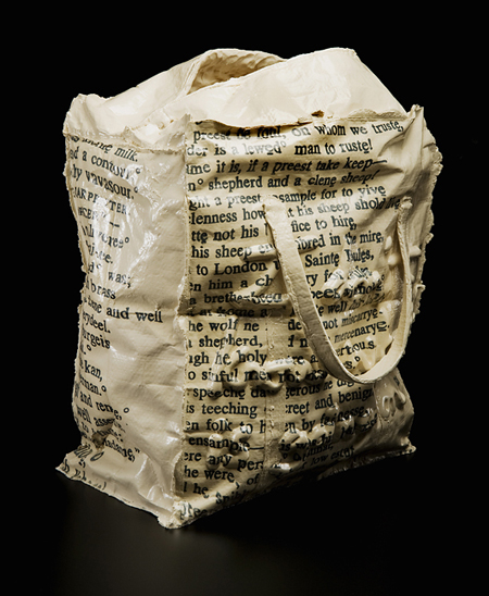
"Jonathan’s work deals with the strange and complex relationships that exist between object, written language and the body. Interested in how language can shape thoughts about an object and its context, his works often being inspired by the text’s narrative."

I believe that some of the letterforms are from typewriters and apparently he has designed a typewriter to type out his own handwriting.

type tuesday: forming words at Flow Gallery

Susanne Matsche

I recently heard from Flow Gallery, located in London's Notting Hill. Their current exhibition entitled "Forming Words" includes work by issue 16 cover artist Debbie Smyth. Though I'm on the other side of the ocean, the exhibition has introduced me to some intriguing artists such as Susanne Matche, featured in this post.

​If you are fortunate enough to be in London, a visit to this exhibition promises to be an experience of note:

Flow has asked selected artists to create new work based on a piece of writing of their choice, from poetry to a letter to lyrics. Whether it is the shapes, lines and curves which letters create that inspire the work, as in vibrant wall pieces by Debbie Smyth that motivate the work. Or simply the fluidity of the writing, artists exploring this theme express the diverse approaches and outcomes this one theme can manifest. Many of the artists have chosen to utilise the meaning of their selected text or the message that the text communicates to inform their work. Other artists, such as Aino Kajaniemi take a personal approach to using text with particular memories woven in thread. The work in this exhibition traverses disciplines. Jewellery will be exhibited alongside silver teacups, ceramic vessels and enamel plates. The variety in material has resulted in an exhibition that intends to capture the endless inspiration of the written word.

​The exhibition continues until May 17.

Susanne Matsche

Susanne Matsche

Susanne Matsche

type tuesday: Daniël Maarleveld

Daniël Maarleveld is a designer based in Amsterdam.

"I have been working as a freelancer since my graduation from Gerrit Rietveld Academy in 2007. I work together with a number of different designers, programmers and artist to create typefaces, books and websites. In some of my work I am searching for unexplored possibilities of new or existing techniques based on mathematical or mechanical principles. This results in work that balances between machine and hand made work."